Depressingly for half of the world’s population, women’s health has generally been seen as a dirty word in the medical industry up until recently.
Thankfully, there’s a ray of hope in the form of the burgeoning femtech sector, with brands such as Elvie addressing issues around previously taboo subjects such as sex, periods and birth control.

Launched in 2018, fertility tech company myLotus gives people the tools and information to optimise their chances of having a baby, using an app and ovulation tracker that detects the luteinising hormone in urine.
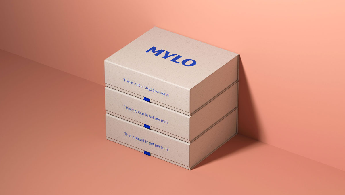
Ragged Edge was commissioned to relaunch the brand and create a visual identity that would reflect the often unpredictable reality of the conception experience.


Changing the company name from myLotus to Mylo set the tone for the rest of the rebrand by making it feel more contemporary and non-gender specific – something that is key as the company looks to expand its remit and product offer in the future.
A new logo and illustrations feature rough, handmade style edges, and the tone of voice aims to be informative and supportive without being overly scientific.
Meanwhile, the colour palette is made up of a variety of skin tones, complemented by a bright blue accent colour.
“Getting pregnant is not always a matter of time, it’s more a matter of timing,” says Max Ottignon, co-founder of Ragged Edge.

“Mylo gets real about conception. Real information, real empathy, for real women and men facing the realities of trying to have a baby.”
The post Femtech brand Mylo gives fertility a fresh look in new identity appeared first on Creative Review.
from Creative Review https://ift.tt/2HjErtH

No comments:
Post a Comment