“I saw Malika Favre’s book at her launch and was amazed with all the work she had done. It made me want to have a look at what I had achieved over the last few years,” says Parisian illustrator Marylou Faure, who’s just released her first monograph. “I tend to never look at projects again when they are done and move on to the next, so this was the opportunity to stop and actually acknowledge the work I had produced.”
Faure’s style is bright and bold, and she’s built up a portfolio of strong work full of collaborations with brands including Nike, Spotify, YouTube, Apple, MTV, Deliveroo and more. Alongside this, Faure has also maintained a self-initiated practice and through this she’s been able to experiment with the female form, colour and composition.
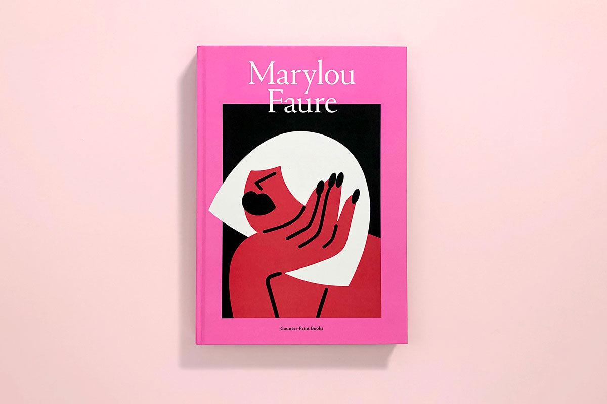
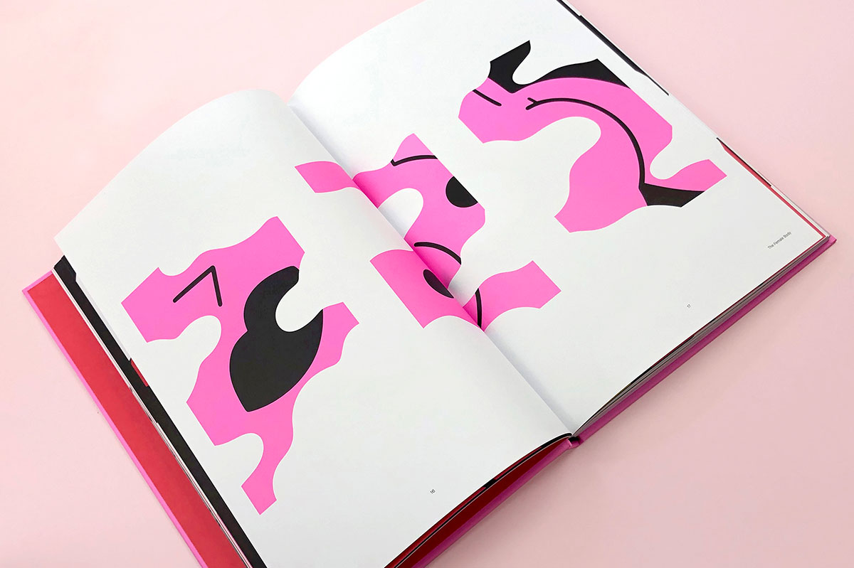
While she prefers to focus on big swathes of colour in favour of fine detail, her characters are playful, cheeky and full of personality. The book’s design echoes this and working with Céline Leterme and Jon Dowling at Counter-print, Faure wanted to make the book large in scale with full-page illustrations to make it really pop. To add to this sense of vibrancy and joy, the book has also been printed entirely with Pantone colours, elevating the reproductions to art book territory.
“My first thought was to only put in the work that I still liked. I get bored very quickly and I like to think my style keeps evolving, so I’m pretty harsh with my own work when I feel it’s not as good or feels dated,” Faure says of her selection process. “After a few chats with Counter-print, we found that the work could fit nicely in three chapters, focusing on different aspects of my work. The female body had to be one of them, as it’s really the core of my work, and then I thought it’d be interesting to explain a bit more how I create my compositions, as well as talk about the message behind my work.”
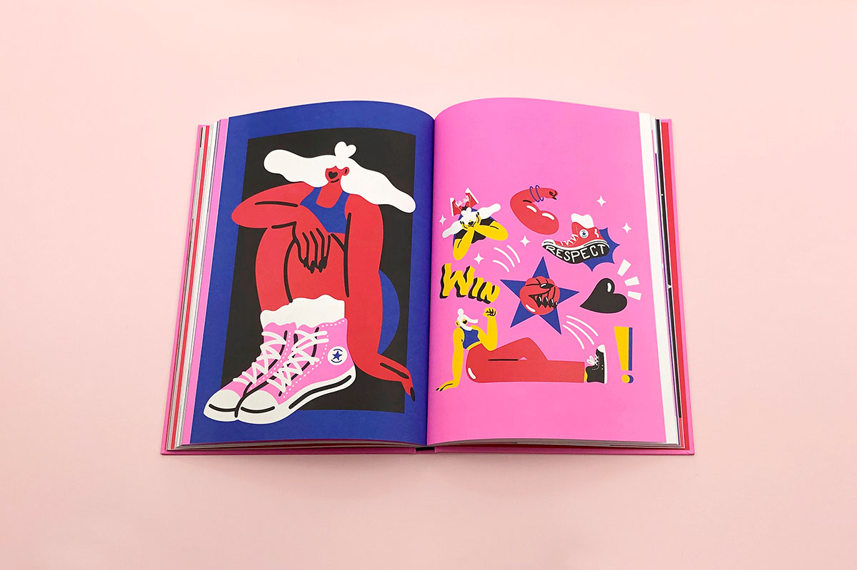
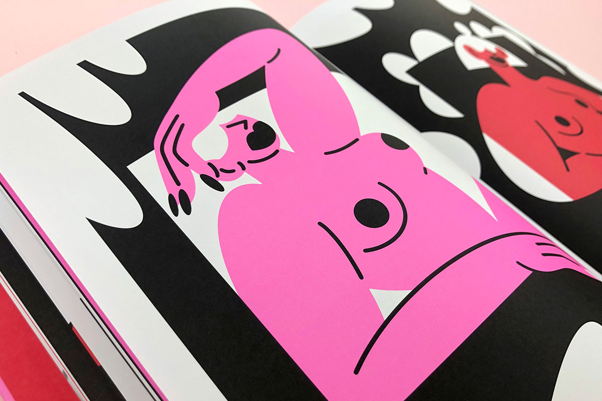
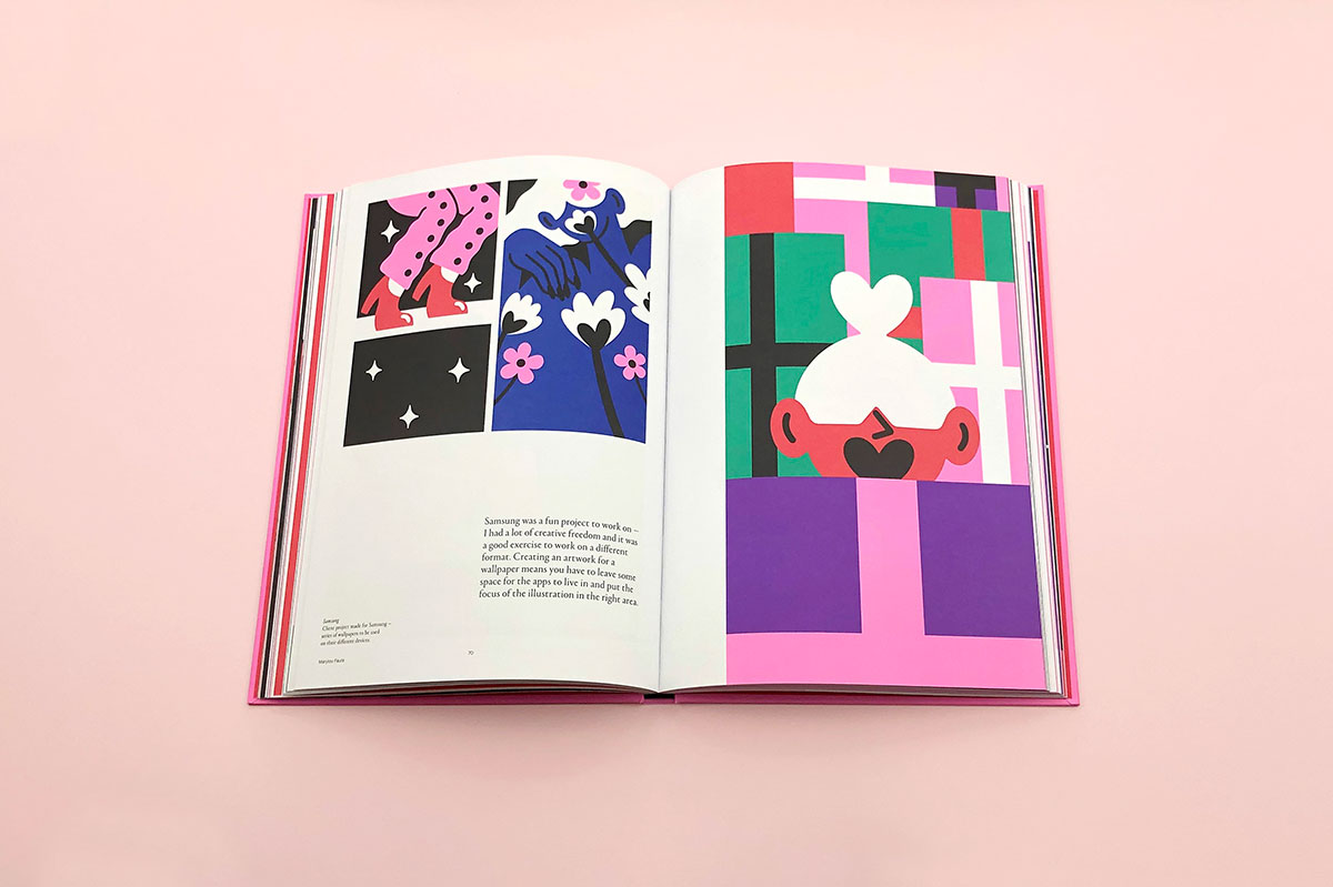
By separating the book into chapters, the book becomes more than a sketchbook or archive of images, and alongside the illustrations are snippets of insight and advice from Faure. Though writing about her own work was a new experience for the illustrator, the biggest challenge was making the illustrations themselves fit together to become a considered collection. “Though that was another advantage with using a strict colour palette, I had to modify a lot of my artwork so the colours would fit in together, and it helped make everything look more harmonious,” explains Faure. “I also had to vectorise all of my work, and that took a lot of time.”
The process of putting together a book has made Faure realise how much work she’s actually produced over the years, despite her initial worries of not being able to fill an entire book’s worth. “It’s a very interesting process, it makes you see how much your style has evolved, and again, as I’m usually quite dismissive of my work when it’s done, it forced me to sit down and go through everything I had done over the last five years,” says Faure.
At just over 200 pages, the monograph feels like a trip through Faure’s imagination, but the illustrator hopes it will be more than a beautiful object. “I just want to share my experience and advice to anyone who’s interested in my work or in becoming an artist.”




maryloufaure.com; counter-print.co.uk
The post Illustrator Marylou Faure on putting together her first monograph appeared first on Creative Review.
from Creative Review https://ift.tt/2RK6ZhR

No comments:
Post a Comment