London-based studio Sennep specialises in designing and building digital products for the likes of Google, Barclays and the Guardian. In their spare time, however, the team behind the studio have also carved out a niche for themselves creating a series of innovative and engaging digital games.
Developed with games publisher Rogue Games, Olo was launched in 2012 as a digital take on the traditional gameplay of air hockey, curling and shuffleboard. The studio has teamed up with Rogue Games again for sequel Olo Loco, featuring a new set of eccentric Olomojis, a new soundtrack and enhanced game modes.
Here, Sennep co-founder and creative director Matt Rice discusses the challenges of rethinking the original Olo format, creating the game’s playful aesthetic and the value of pursuing passion projects in general.
Creative Review: Tell us a bit about how the original Olo game came about?
Matt Sennep: Back in 2003, when we started Sennep, we pledged to work on at least one self-initiated project a year. In the 17 years since then, the passion projects at Sennep have been varied and broad. They are driven by our curiosity and love for making and experimenting with visual expression and new technology.
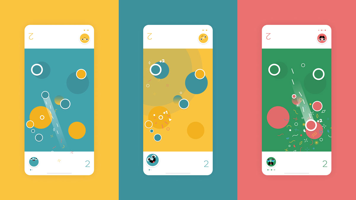
Smaller in scope are our coded-experiments, otherwise known as ‘Sennep Seeds’. The original Olo game grew out of one of these ‘seeds’ — an experiment with a 2D physics engine and HTML5. By flicking discs around an iPad screen and chatting excitedly as a team, we stumbled upon a game mechanic that we all found fun to play.
A loose hybrid of air hockey, shuffleboard and curling was born and named Olo (to echo the simplicity of the game and the design of the playing field). We released the game as a browser-based web app, and within a couple of weeks had 50,000 downloads, some favourable reviews and, most importantly, a concrete ‘proof of concept’.
This feedback gave us the confidence to invest in designing and building our first iOS game, and our first sellable product. Olo launched in 2012 as the App Store’s editors choice and has continued to be a firm favourite in the App Store over the last eight years, having been played tens of millions of times. We couldn’t have imagined any of these things happening off the back of a technical (coded) doodle.
CR: Why did you decide to launch Olo Loco as the sequel, and how does it differ from the original version?
MS: The original game had become neglected over time as we moved onto new things, and that made us a bit sad. When the publishers, Rogue Games, contacted us with the idea of breathing new life into Olo, we knew that there was room for improvement, and it was time to reimagine certain aspects of the game.
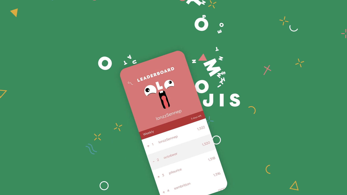
We want to stay true to the original but add a new flavour. We knew that the online experience needed updating and rethinking, and that was the springboard for most of the updates. We made the online mode asynchronous so that players could play a turn even if the opponent wasn’t online, and with that fundamental change started looking for ways for players to communicate with each other. This led to the idea of leaving little taunts or expressions of emotion about their last shot to their opponent.
One of the joys of the game is that players can swing from imminent victory to crushing defeat in one move, and with that comes emotions of happiness or despair. With that in mind, we introduced the Olomoji family to let players express these emotions and sharpen the competitive edge in the new and reimagined online mode.


CR: Talk us through the overall aesthetic of the game and its key design elements.
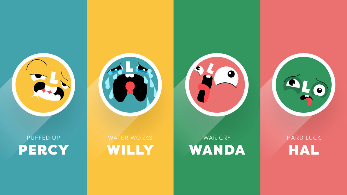
MS: Olo’s aesthetic is minimal and clean to suit the simplicity of the gameplay. The challenge with this pared-back approach, however, particularly in games, is the perception that it is devoid of character or not visually compelling. To counter that … we wanted the game to have its own distinct character, so we worked with illustrator and animator Ben Pearce to help us bring to life the Olomoji family.
These characters are there to bring an upbeat and slightly screw-loose personality. They add humour and irreverent fun through their expressions and reactions, representing common emotions felt by players in the game: anger, sadness, frustration, surprise, happiness, distress, delight and disgust.
Whereas the tone of the original felt like an understated, low-key jazz bar, we wanted the sequel to feel more like an out-of-control street carnival. One key element in setting the tone is the soundtrack, so we worked with long-term collaborators Coda to Coda to write the music and provide all the sound effects.
We also introduced a lot more visual, haptic and audio feedback on interaction. Everything reacts to player interaction: Sliding the Olos, the collisions, the steals, and the scoring all bring the otherwise minimal game board to life with explosions of confetti, colour pulses and animation.
CR: What do you think the value of making time for passion projects like Olo is in general?
MS: We know from experience that exciting, self-initiated R&D projects are highly motivating for designers and developers. At a time when design studios need to stand out stronger than ever before, these projects help us sharpen our skills, and invite us to try new things and take more creative risks.
Exploring and experimenting without constraint allows for more freedom and more chance of serendipity – discoveries along the way have more time to evolve, blossom and influence the result. Also, if you control the timeline and budget, there is less need to compromise – nice-to-haves can become must-haves rather than being left behind. After all, even the smallest details can be essential to a great experience.
If these projects are financially successful, then that is a massive bonus. But creativity and learning are as much a priority as financial reward. We believe that if fun and joy are part of the making process, they will come out in the final product. The great thing about working in digital is that the product is always a work in progress, and it is not until you get real live user feedback that can you refine and perfect the experience. That’s what we are most excited to look at next.
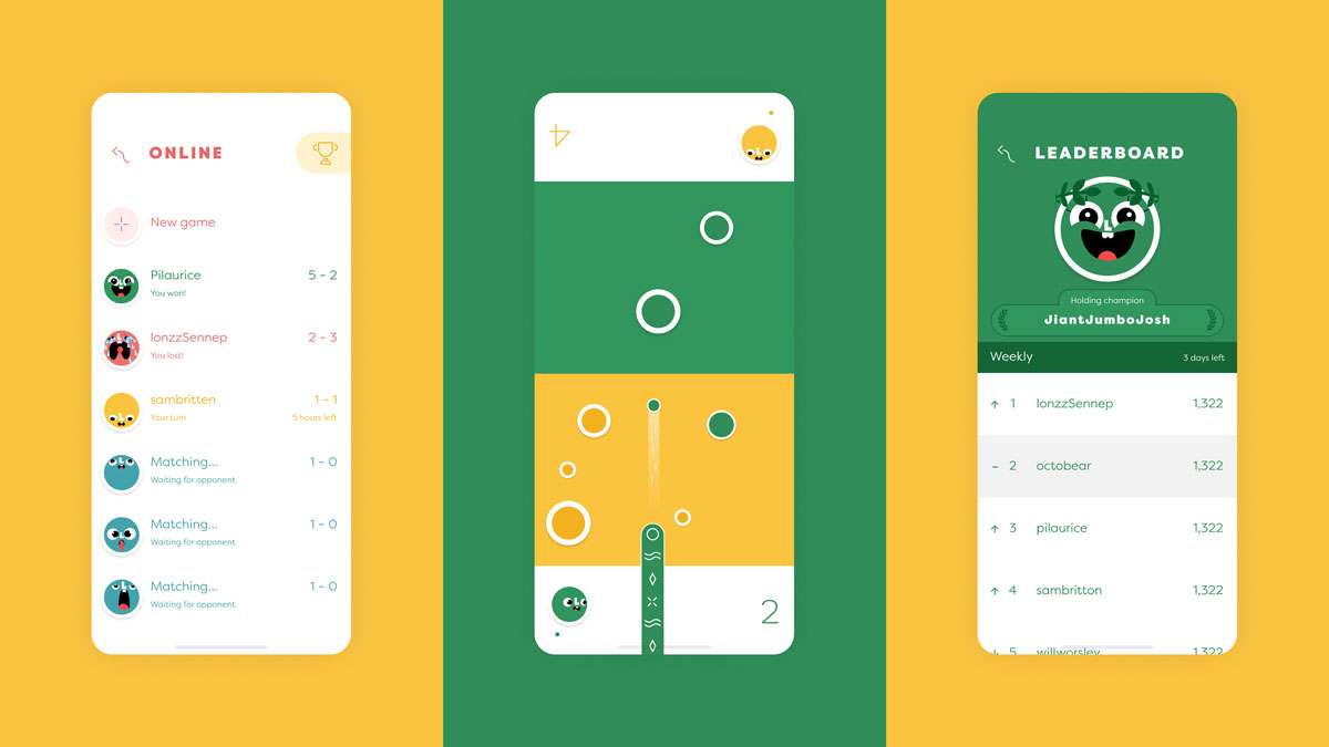
Olo Loco is available on the App Store and Google Play; sennepgames.com
The post Olo Loco puts a playful spin on the classic game of shuffleboard appeared first on Creative Review.
from Creative Review https://ift.tt/309eMub

No comments:
Post a Comment