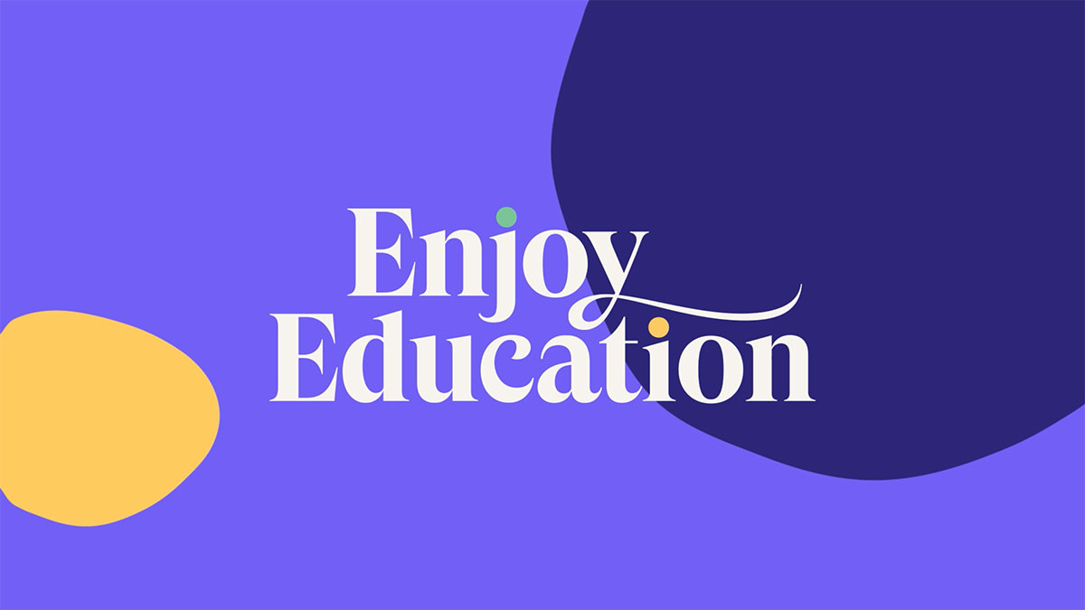
Home education has predictably seen a bit of a boom over the last six months. Enjoy Education, a private tutoring and homeschooling business that was set up in 2006, is just one in an evolving market of similar businesses, and so to help it stand out, Studio Output has created a new brand identity and website, which plays to the brand’s strengths.
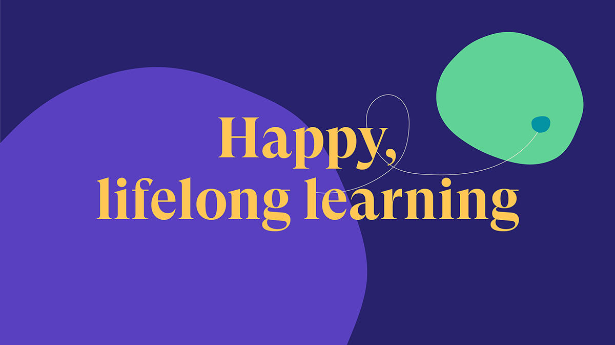
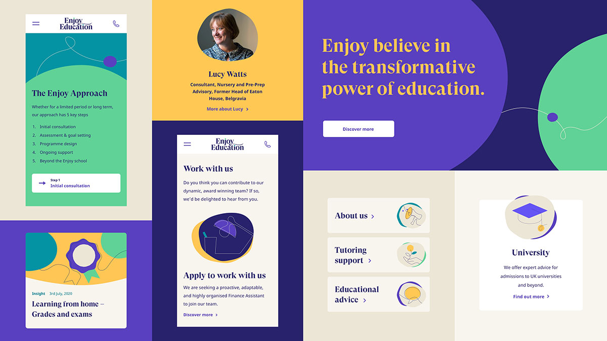
Perfectly timed for the back-to-school rush, the new identity has been inspired by Enjoy Education’s positive energy and vision for its clients which is, “happy, lifelong learning”. The brand aims to provide tailored support for all of its students in a joyful environment, so Studio Output has developed a playful design language centered around an organic ‘thread’.
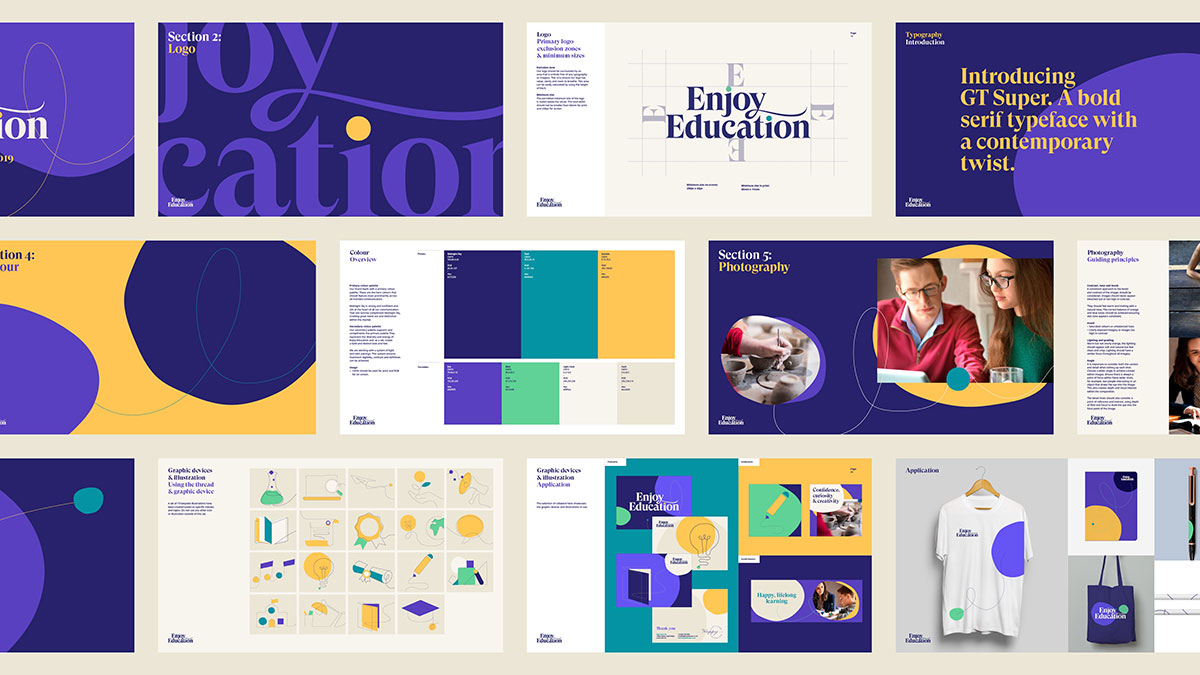
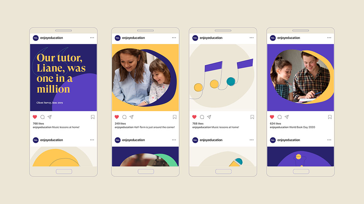
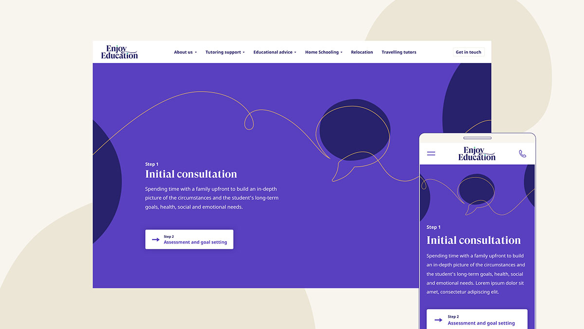
This so-called thread has been translated into an array of simple line illustrations and icons that can be manipulated easily, creating a sense of connection and movement, which is echoed throughout the identity.
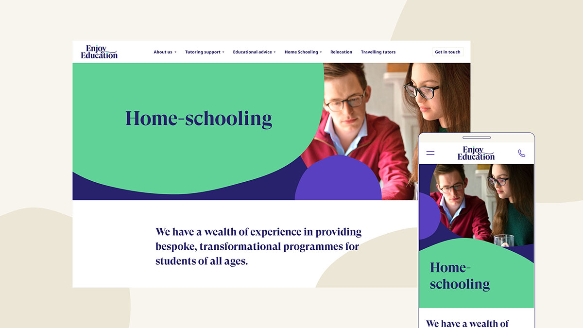
Alongside the thread visuals are a series of freeform shapes that add interest to the modular design system, which is made up of structured grids and clear layouts. With injections of blues, purples and greens, the idea is to create a website that’s inviting but not overwhelming for newcomers.
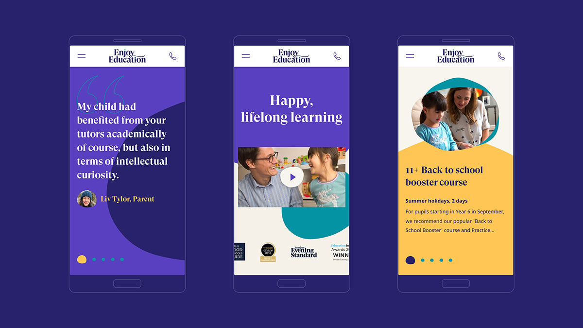
Enjoy Education’s previous logo was monochromatic and lacked character, and so the new iteration embraces the identity by mimicking this balance of rigour and spontaneity. For instance, the flourish of the y in Enjoy and the brightly coloured dotted i’s adds in a bit of interest and colour.
“It’s been a great journey with Output,” says Kate Shand, CEO and Founder of Enjoy Education. “They listened to our brief and worked in partnership with us to deliver our vision with a beautiful, innovative website.”


The post Studio Output creates rebrand for homeschooling platform Enjoy Education appeared first on Creative Review.
from Creative Review https://ift.tt/2ZhrF52

No comments:
Post a Comment