Founded in 2014, Bow-based distillery the East London Liquor Co produces a range of spirits, including gins, vodka, rum and whisky, which it distributes across the UK and internationally.
Already a firm favourite among bartenders, the distillery approached branding agency Ragged Edge to refresh its visual identity in order to help it appeal directly to drinkers.
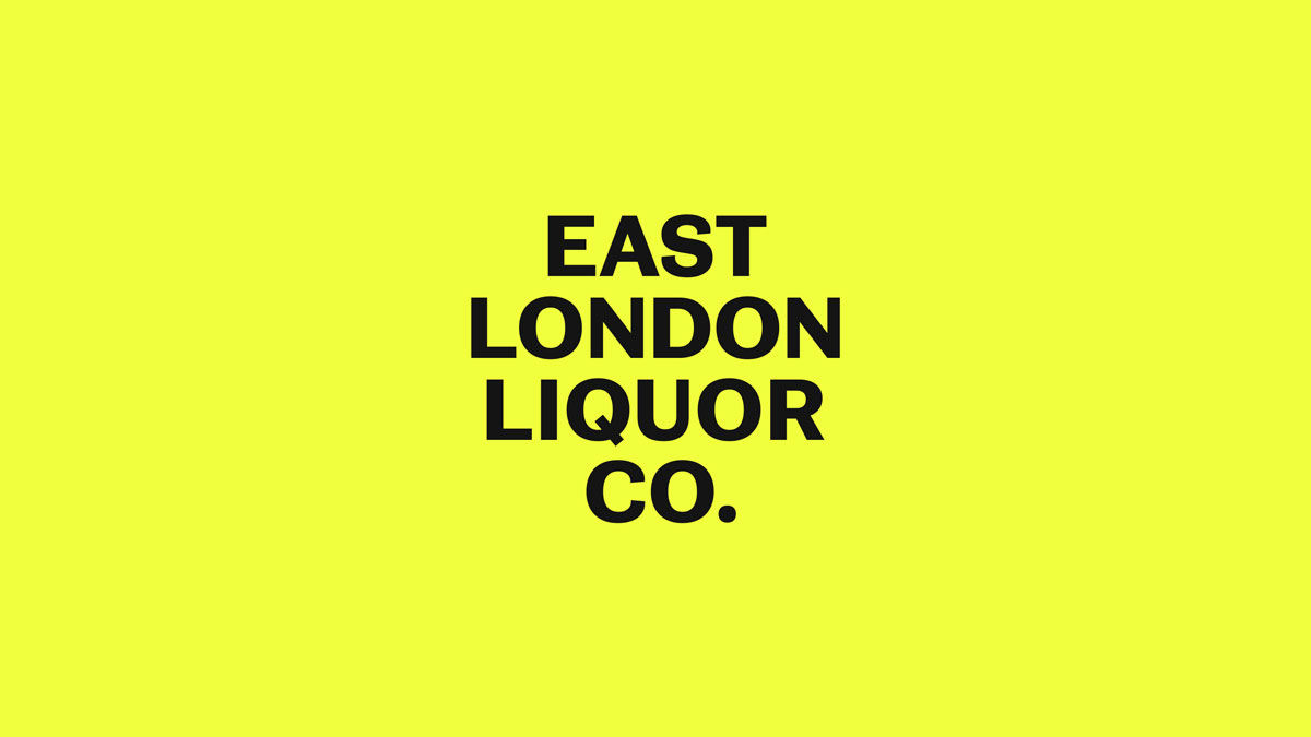
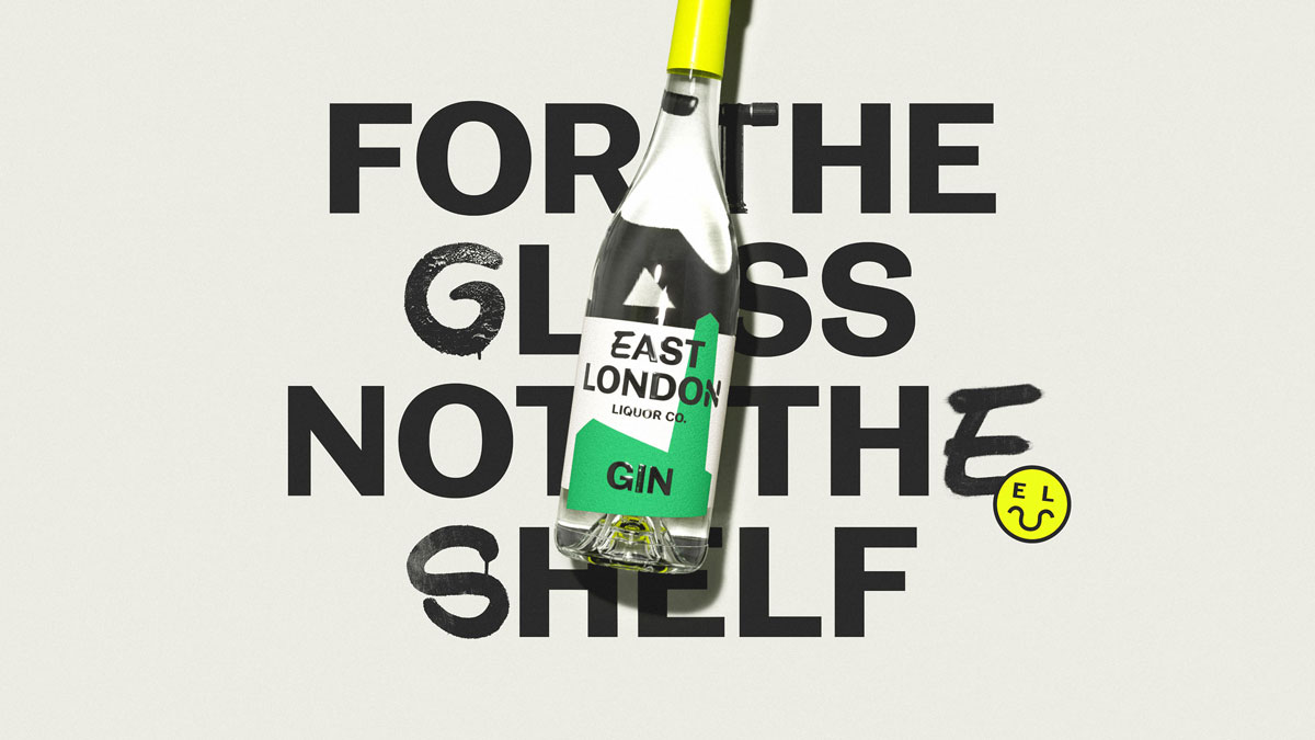
The new identity is based on a simple proposition intended to set it apart from the raft of craft-focused spirits brands already on the shelves: decent booze at a decent price.
“East London Liquor Co make great drinks without the crafty bullshit. But to really succeed, they needed to take the fight beyond the idiosyncratic world of craft spirits,” says Ragged Edge co-founder Max Ottignon.
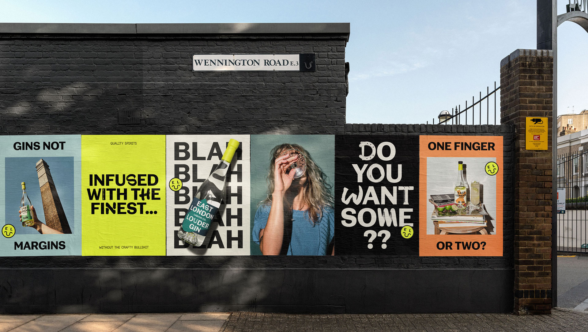
“So we helped them build a brand that’s unpretentious, unapologetic, and unabashed in its flagrant disregard for convention.”
The agency created a custom typeface with with NaN Foundry, which is made more unique with glyphs inspired by the local area, the distillery itself, and the production process.
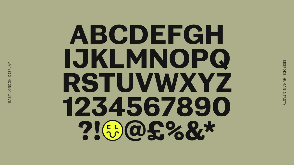
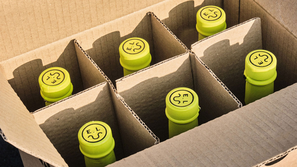
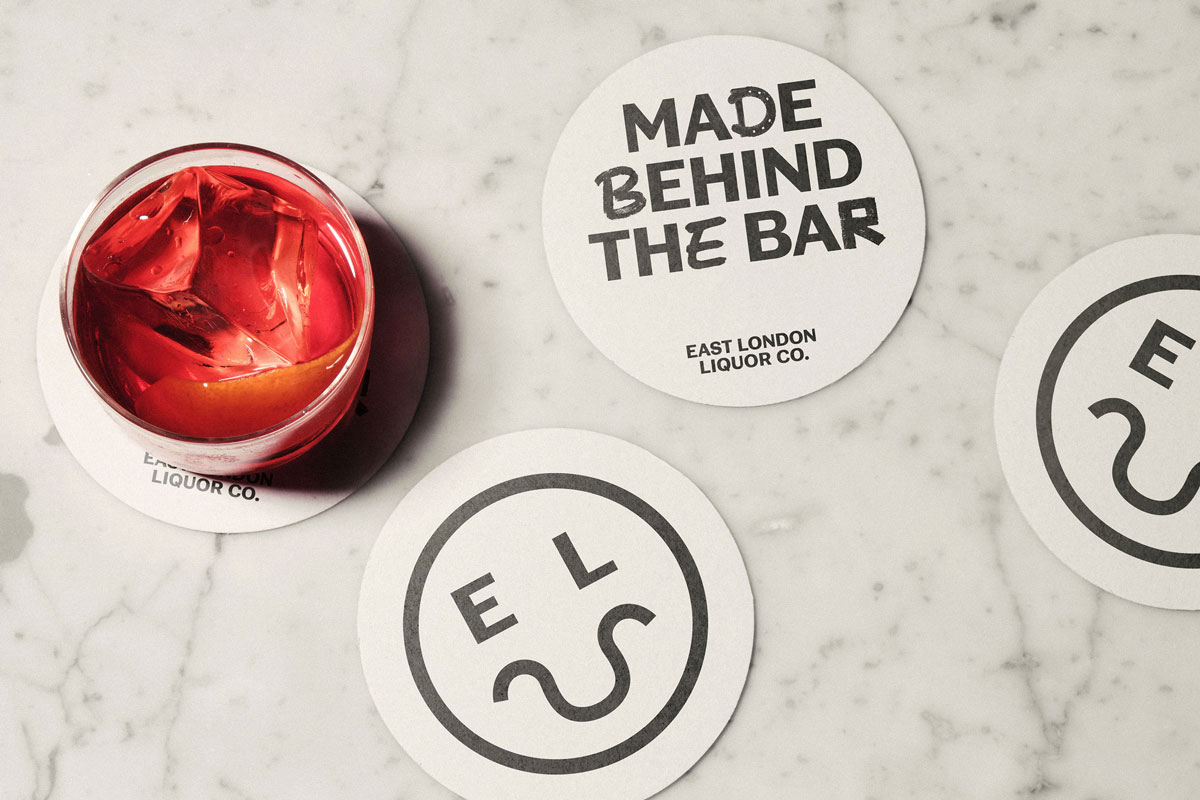
A fluorescent yellow ‘smiler’ icon is inspired by an old crest found in nearby Victoria Park, and incorporates the shape of the River Thames to create a unique smiley emoji.
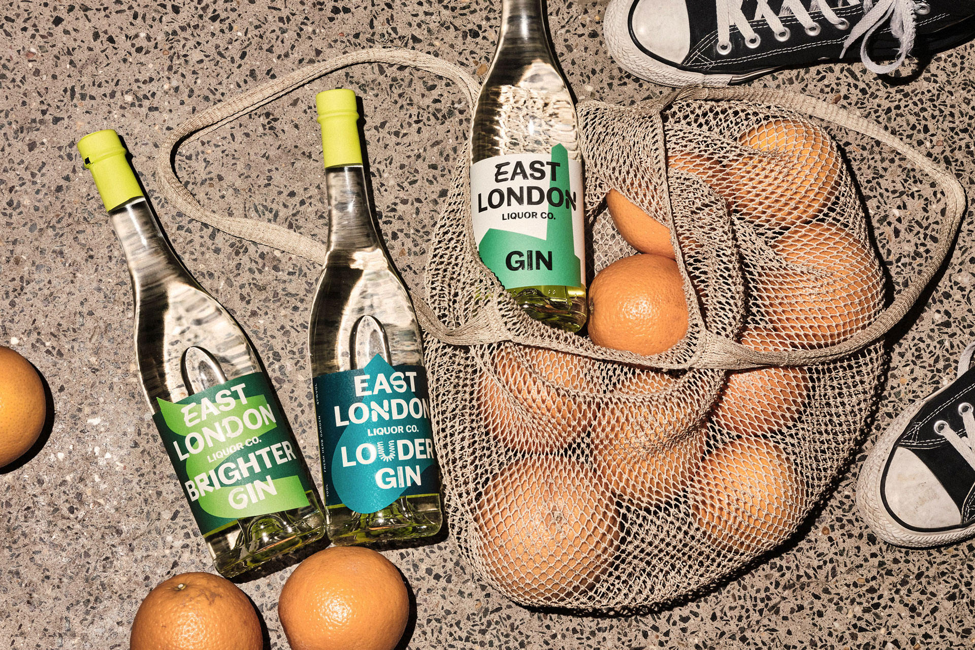
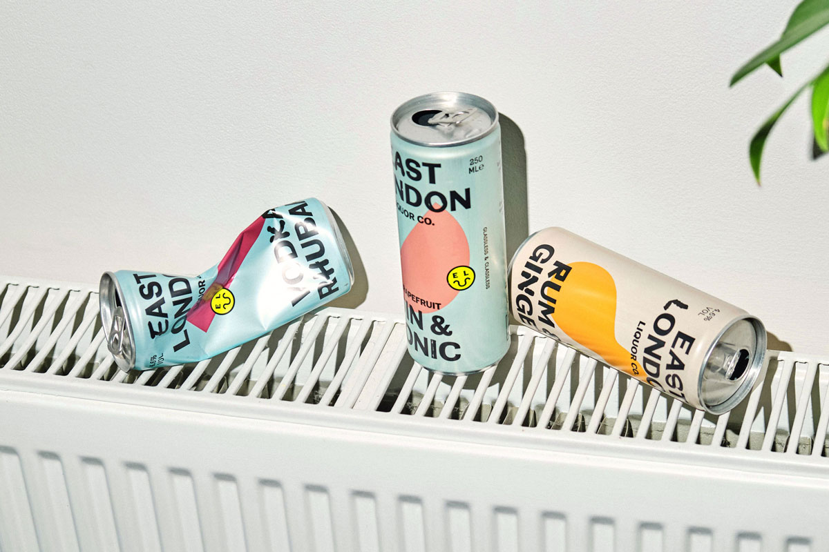
The identity has been brought to life on East London Liquor Co’s existing product ranges and several new ones, which are tied together using a vibrant colour palette and abstracted graphics.
Meanwhile, new art direction gives a more candid feel to the distillery’s digital presence, with lifestyle imagery created in collaboration with photographer Charlie McKay.
The post A refreshing new look for the East London Liquor Co appeared first on Creative Review.
from Creative Review https://ift.tt/34VAljH

No comments:
Post a Comment