This year should have marked the release of the hotly anticipated 25th instalment in the James Bond film franchise, No Time to Die. As with much of the movie industry however, coronavirus has thrown a bit of a spanner in the works. The film’s release date was originally pushed from April to November when the pandemic struck, and since then has been further delayed until 2021.
A small ray of hope for 007 design nerds comes in the form of a personal project by graphic designer and illustrator Matt Needle, titled Bond Redesigned. The Cardiff-based designer has spent the last decade building up a movie industry client base including Warner Bros and Marvel, but he has spent the last seven months of lockdown creating an alternative movie poster for every film in the franchise since it first began in the 60s.
Here, we speak to Needle about the inspiration for the project, the process of bringing the alternative poster series to life, and why making time for passion projects is invaluable when it comes to your commissioned work.
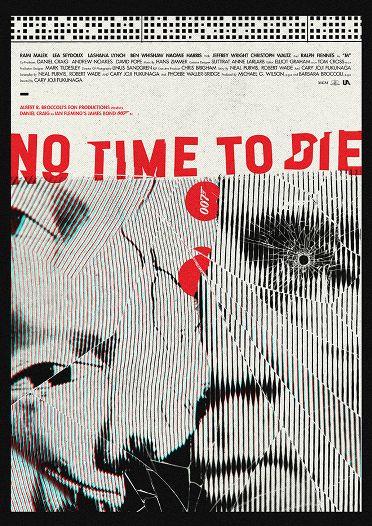
Creative Review: Tell us about how you got into designing film posters.
Matt Needle: I actually started while still in university, and have worked for a few studios and magazines, but decided early on I had to be my own boss to make the work I wanted to make. I started making alternative film posters as something to keep me busy and creative in the summer holidays. I would put them on my blog and they would kind of get spread around on the internet.
I started getting featured in magazines, leading to me being invited to take part in some great projects and exhibitions. Fast forward a decade and I now pretty much exclusively work on key art for films – recent clients include Disney, Marvel, Star Wars, Array Films and BFI – and editorial illustrations for magazines, newspapers and websites.
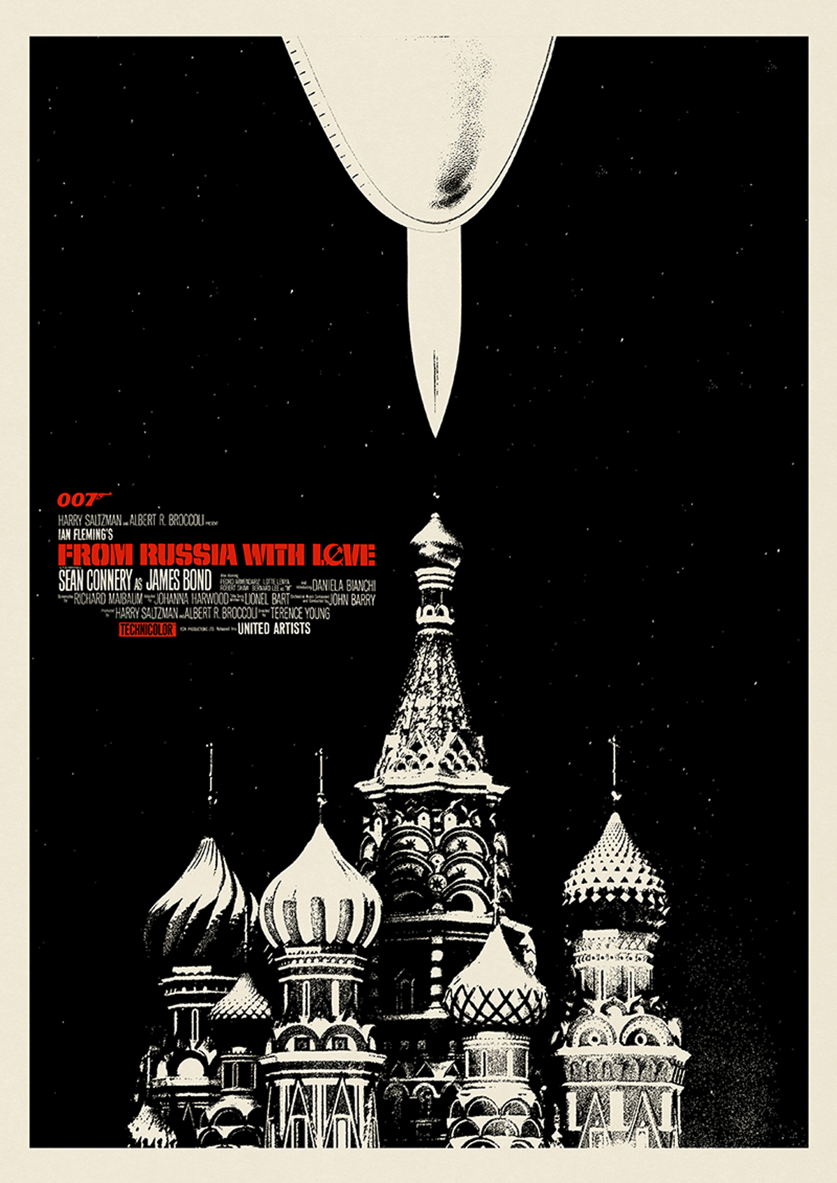
CR: Have you always been into the Bond films?
MN: I’ve loved Bond movies for as long as I can remember. They were always being re-run on ITV here in the UK, and I remembered being enamoured with the series and excited and inspired by the existing artwork for the older films as a child.
CR: How did the idea for this personal series come about?
MN: It’s actually a project I’ve been thinking about doing for years but have always been too busy. I decided that since No Time To Die was soon to be released (at the time) and a lot of my projects were being put on hold due to the coronavirus pandemic, now was the perfect time to work on something personal that could also be open and experimental.
I envisaged it as a way for me to try things out creatively that some day-to-day projects wouldn’t allow. From there the series spawned a bit of a following online, and it seemed that people were enjoying seeing the project unfold as much as I loved doing it.
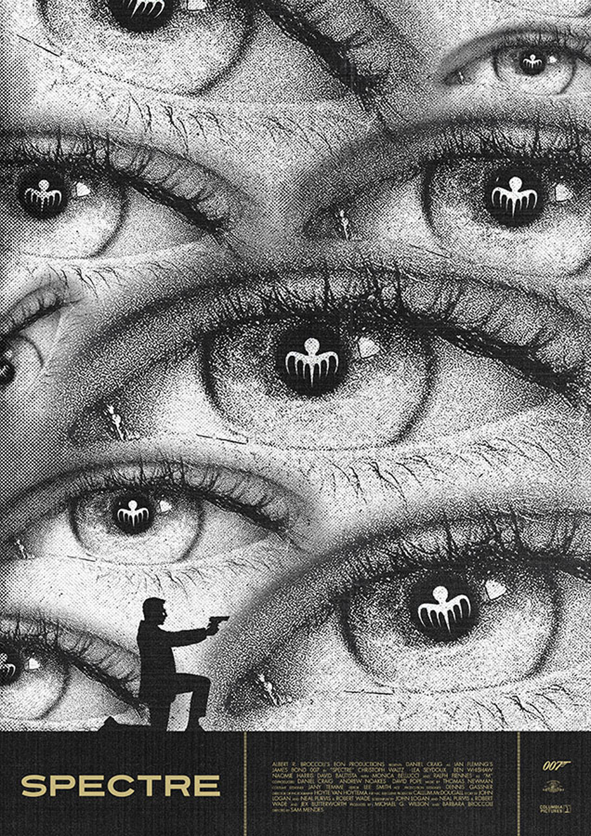
CR: How have you approached redesigning each of the posters?
MN: As I mentioned, each design was meant to experimental. They were never meant to look or feel the same as each other, but you can still tell that it’s one body of work. I approached each piece by rewatching the film and picking key elements, whether a scene, a weapon or just a pattern, some lighting or shape or colour.
That drove me forward into a stylistic experiment of mixing older influences, such as the posters of Bill Gold and the work of people like Hans Hillman, among others, with more contemporary and modern stylistic choices.
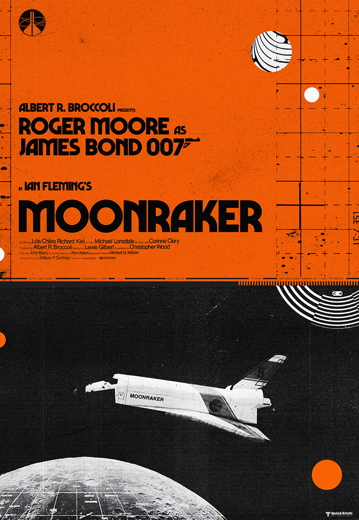
CR: What do you think you’ve learned doing the project over the past seven months?
MN: I’ve learnt that I really like the structure of a project that allows me to work on something new but linked every two to three weeks, taking my time and experimenting, rather than trying to meet a deadline. Also this project was solely for me, the fact that people were into it as well was a bonus, but essentially I was creating pieces that I loved about a subject that I cared about.
Skill and style wise, I think I’ve also got some new bits and pieces in my tool belt for future projects, and am looking for similar personal projects to work on in my downtime. I feel these projects actually help prevent you from getting burnt out.


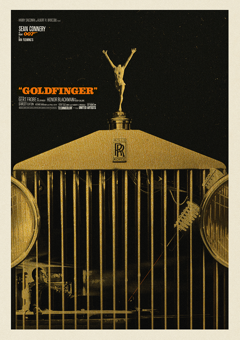


See the full project at @needledesign
The post Bond Redesigned: Reimagining the classic 007 film poster appeared first on Creative Review.
from Creative Review https://ift.tt/377xzdO
No comments:
Post a Comment