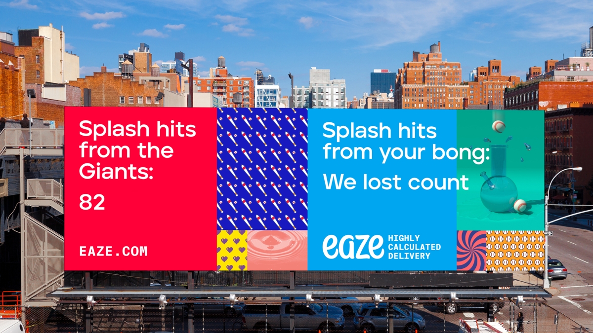
Eaze launched in 2014, and offers an online marketplace that gives buyers legal access to cannabis, as well as on-demand delivery. Born & Bred’s redesign includes a subtle overhaul of the blue-and-white Eaze logo, as well as a flexible grid system, which allows the brand to easily create a series of ads with a consistent style.
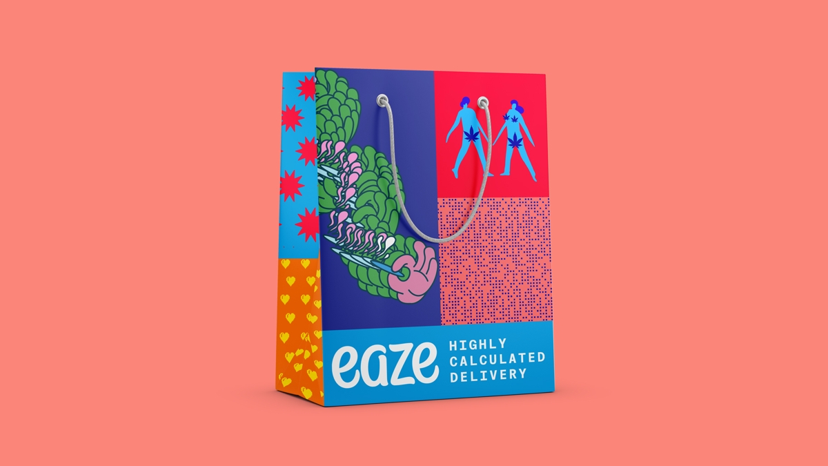
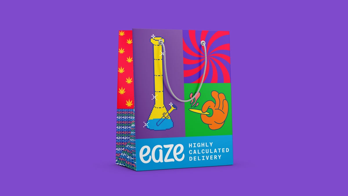
George De’Ath, co-founder and chief creative officer at the San Francisco studio, says the brand update allowed Eaze to “celebrate weed culture”, and it indeed embraces this culture head on, though without resorting to cliché, using fresh colour illustrations and straight-talking copy. Eaze’s bags also unashamedly celebrate cannabis iconography with swirling, clashing patterns and images of bongs and spliffs.


The rebrand reflects changing attitudes towards cannabis, says Eaze’s vice president of marketing, Sheena Shiravi, who comments that the brand is operating in a different market today than even a couple of years back, as cannabis reaches “a whole new level of normalisation”.
The refreshed identity is designed to echo this, as well as “where this very magic plant is taking us in the future”.


The post Eaze’s refreshed branding is a defiant celebration of cannabis appeared first on Creative Review.
from Creative Review https://ift.tt/34H4z9F

No comments:
Post a Comment