Christopher Patten has redesigned the mail-in envelopes for North Carolina ahead this year's US presidential election to make them clearer so the chance of votes not counting is reduced.
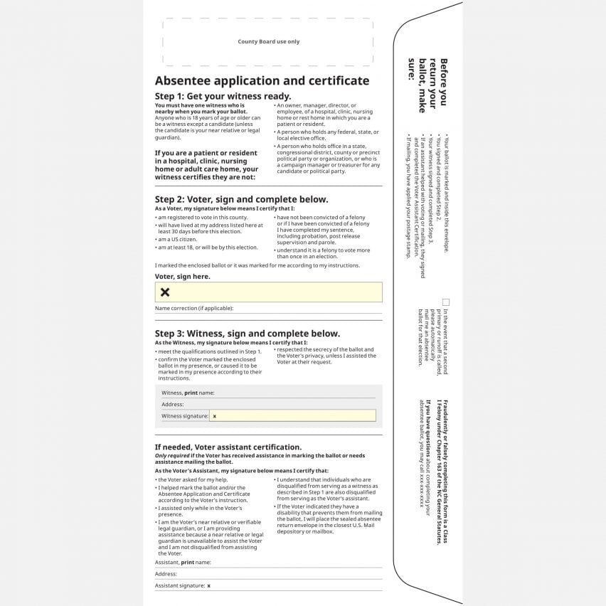
Patten simplified the absentee application and certificate form on the back of the North Carolina mail-in voting envelope, which will be used for the US election on 3 November, with the aim of making it easier to understand for voters.
Voters need to "know exactly what they need to do in order for their vote to count"
If instructions are not communicated clearly and errors are made, ballots can be rejected or have to be resubmitted, Patten told Dezeen.
"One of the biggest problems for election departments, and one of the biggest worries right now around mail voting in the United States, is that a lot of states have these complicated requirements," he said.

"It's become extremely important that we get this right and that people know exactly what they need to do in order for their vote to count," he continued.
"The stakes are really high. There are all sorts of problems if you miss out something really important."
Patten, a designer for non-profit organisation Center for Civic Design, works with election departments to make voting materials like mail-in ballot envelopes, voter registration forms and online portals user friendly.
Designs need to "clearly show what voters have to do"
By using simple principles of good design, he aims to create clear materials that result in fewer mistakes.
"If you design something that clearly shows what voters have to do, and doesn't scare people away, they'll do the right thing," he explained.
"There will always be people that make mistakes but there's just a lot of ways that you can mitigate that with good design."

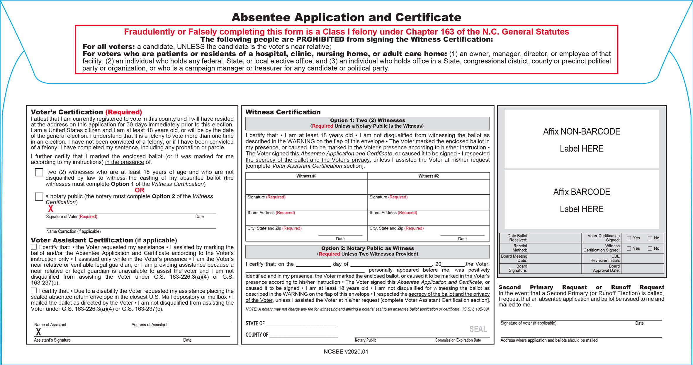
According to Patten, North Carolina's existing envelope was a clear example of voter material being confusing and intimidating.
"The first thing that I think when I look at it is 'did I do something wrong? Or did I commit a crime?', which is a horrible way to start out," he said.
"Right off the bat, anyone who's disenfranchised is going to be skeptical of it."
Redesign "a lot less overwhelming"
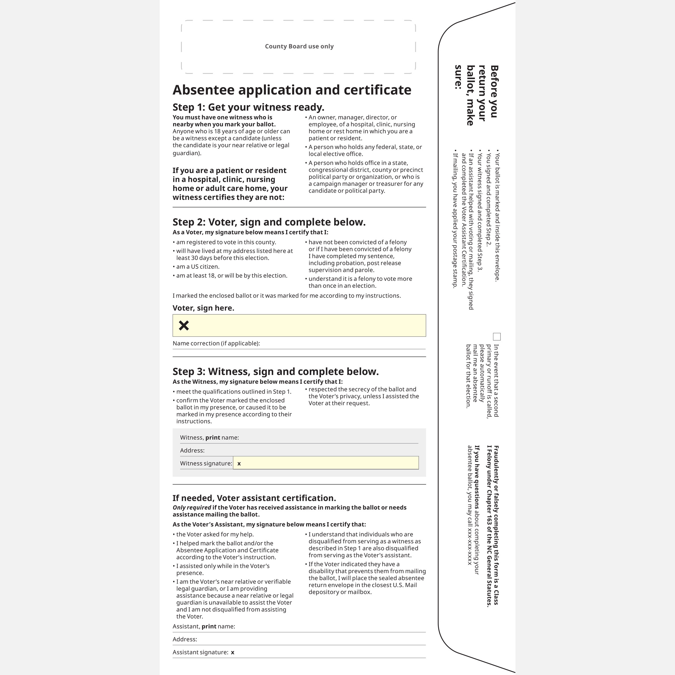
Patten and the Center for Civic Design simplified the certification process into three steps that are clearly displayed: "Get your witness ready", "Voter, sign and complete below" and "Witness, sign and complete below".
The bold red text from the previous form was removed and bold black text with bullet points is used to emphasise certain aspects.

"Rather than a long, scary series of sentences, and red text saying you're going to go to jail if you're not this person, we just put some bullet points, and it's a lot, a lot less overwhelming," he said.
Pale yellow and large X symbols are used to bring attention to the areas where voters and their accompanying witness must sign. A series of "friendly reminders" are listed on the lip of envelope front to ensure the ballots and the envelope form are both fully completed.
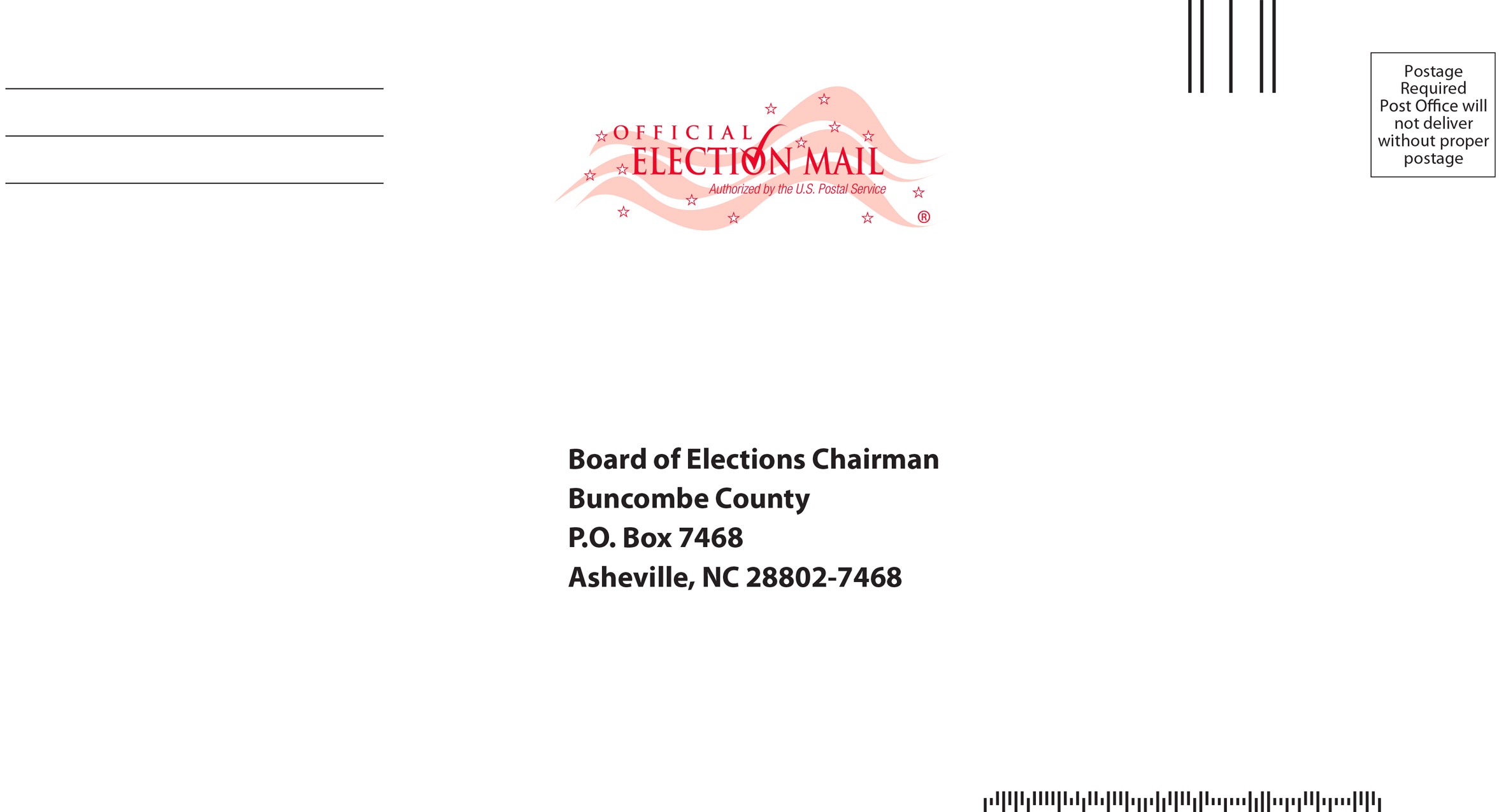
Meanwhile, the front includes a seal that Patten said helps to ensure that people open the envelope and trust its authenticity.
"Election departments don't always know how to communicate with voters"
This year, tens of millions of Americans are expected to vote by mail as a safer alternative to in-person voting during the coronavirus pandemic.
Patten believes that improving the design of voter material is important to make sure that complex voting information will be conveyed to voters.
"The election process is complicated; it's hard to convey that process to people," said Patten.
"Election departments don't always know how to communicate with voters or write instructions or communications that they understand or can interact with," he continued.
"Things are not often visual. Things are often written in complex legal terms that are hard to understand."
The post Good design can reduce voter errors says postal vote envelope designer appeared first on Dezeen.
from Dezeen https://ift.tt/34X3kDJ

No comments:
Post a Comment