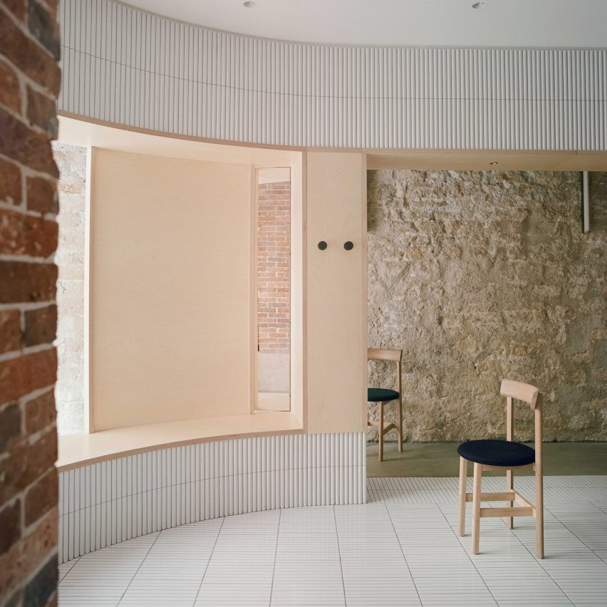
A huge cylindrical volume clad in white tiles sits amongst aged stone walls inside Papi, a restaurant in Paris designed by Neri&Hu.
Papi can be found in the French capital's ninth arrondissement, taking over the ground floor of a 19th-century Haussmann building.
Rather than modernising the 52-square-metre site of the restaurant, Neri&Hu has instead tried to showcase the "layers of material heritage" that denote the building's long and storied past.
The Shanghai-based studio explained the building works had to be carried out "as carefully as an archaeological dig".
"Every single existing element was meticulously examined, and the challenge was in resisting the urge to fix every imperfection, to instead honour the imprint of time upon each surface," added Neri&Hu.
"Each fragment represents a different period in Paris' history, forming a beautiful yet challenging existing canvas for [Neri&Hu] to intervene."
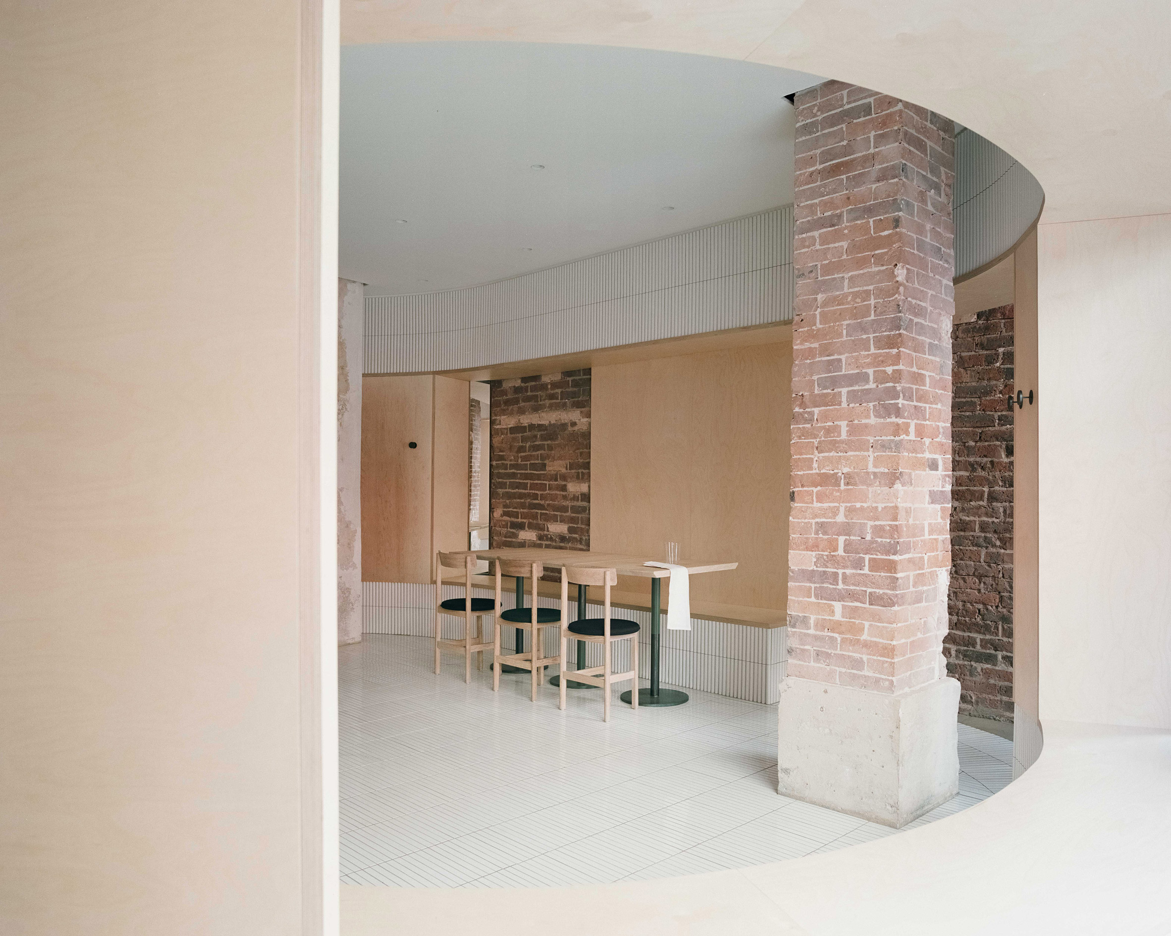
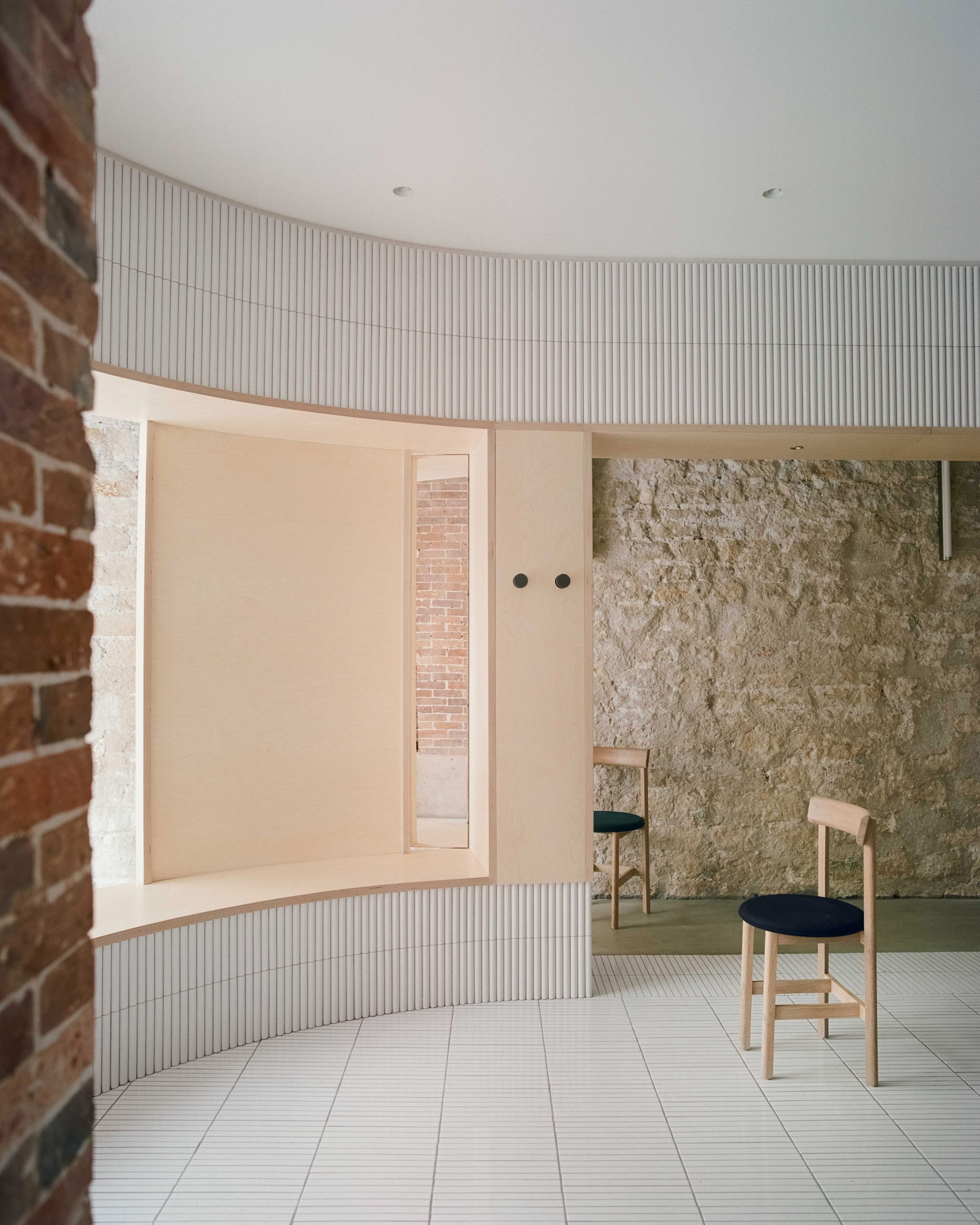
Wallcoverings and finishes that have built up over the years from previous occupants have been peeled back to reveal the building's older brick or limestone surfaces.
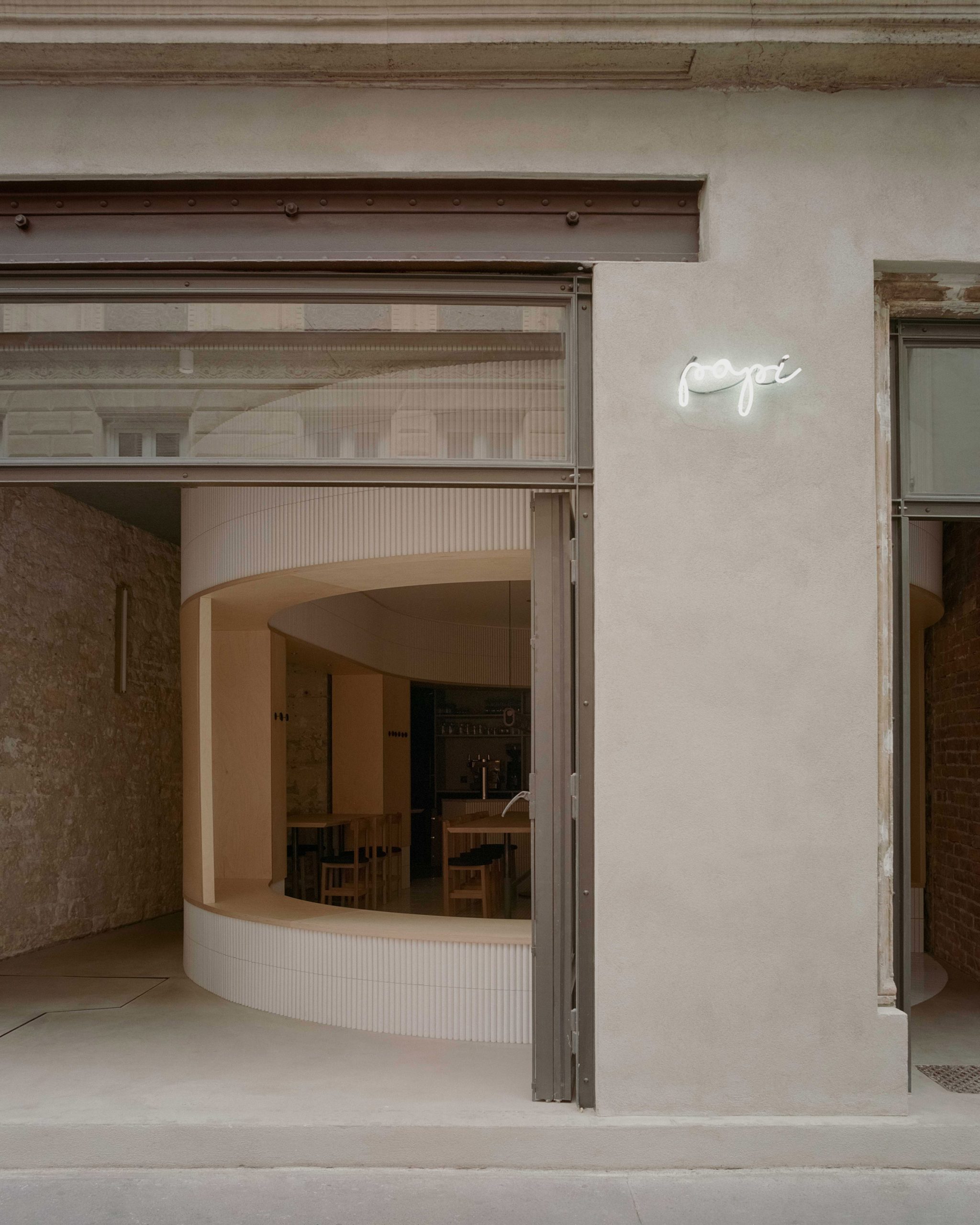
Aged stone moulding that borders the entrance door has also been exposed, and a slim cut-out has been made in the facade to reveal an existing steel lintel.
Similar steel has been used to frame the expansive panels of glazing that front the restaurant. These can be slid back during the warmer months, diffusing the boundary between Papi's diners and passersby on the street.
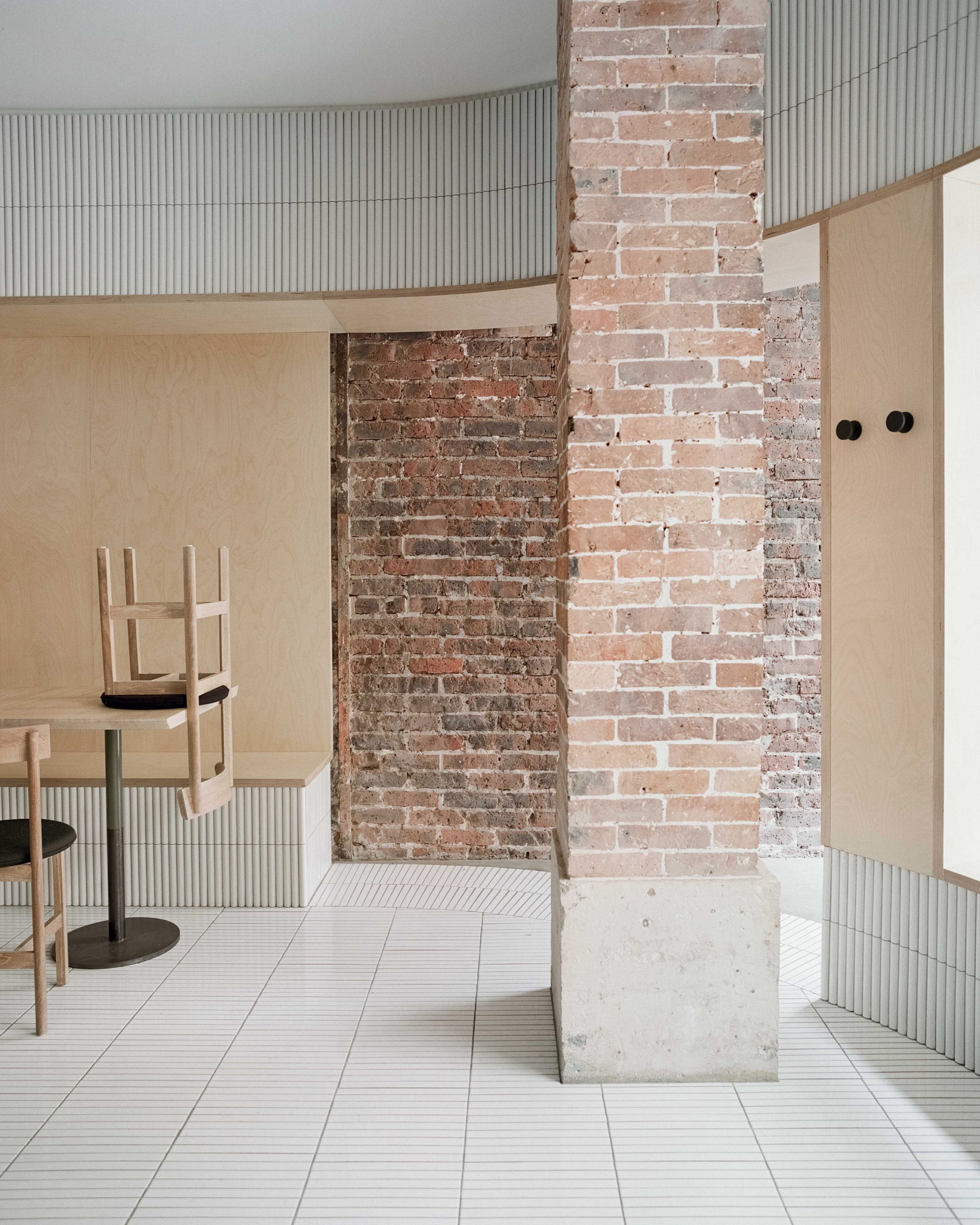
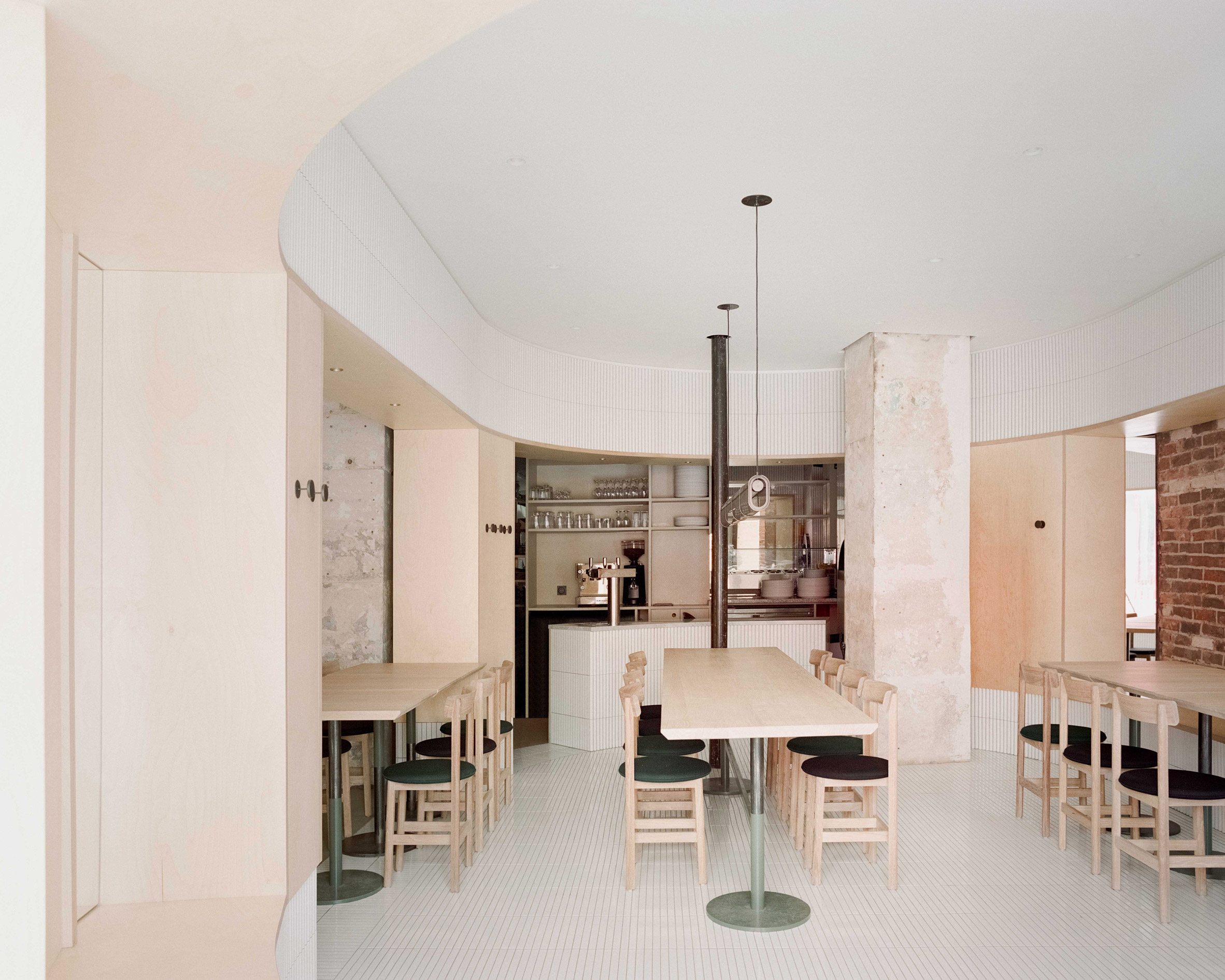
The most significant contemporary addition that Neri&Hu have made to the interior is a towering cylindrical volume that encompasses Papi's eating area.
Clad in narrow white tiles, the volume has been placed slightly off-centre so that it butts up against the right-hand side of the restaurant.
Inside are a handful of wooden dining tables and chairs. Guests can alternatively opt to sit on one of the bench seats that have been fitted in the birch plywood-lined openings running around the perimeter of the volume.
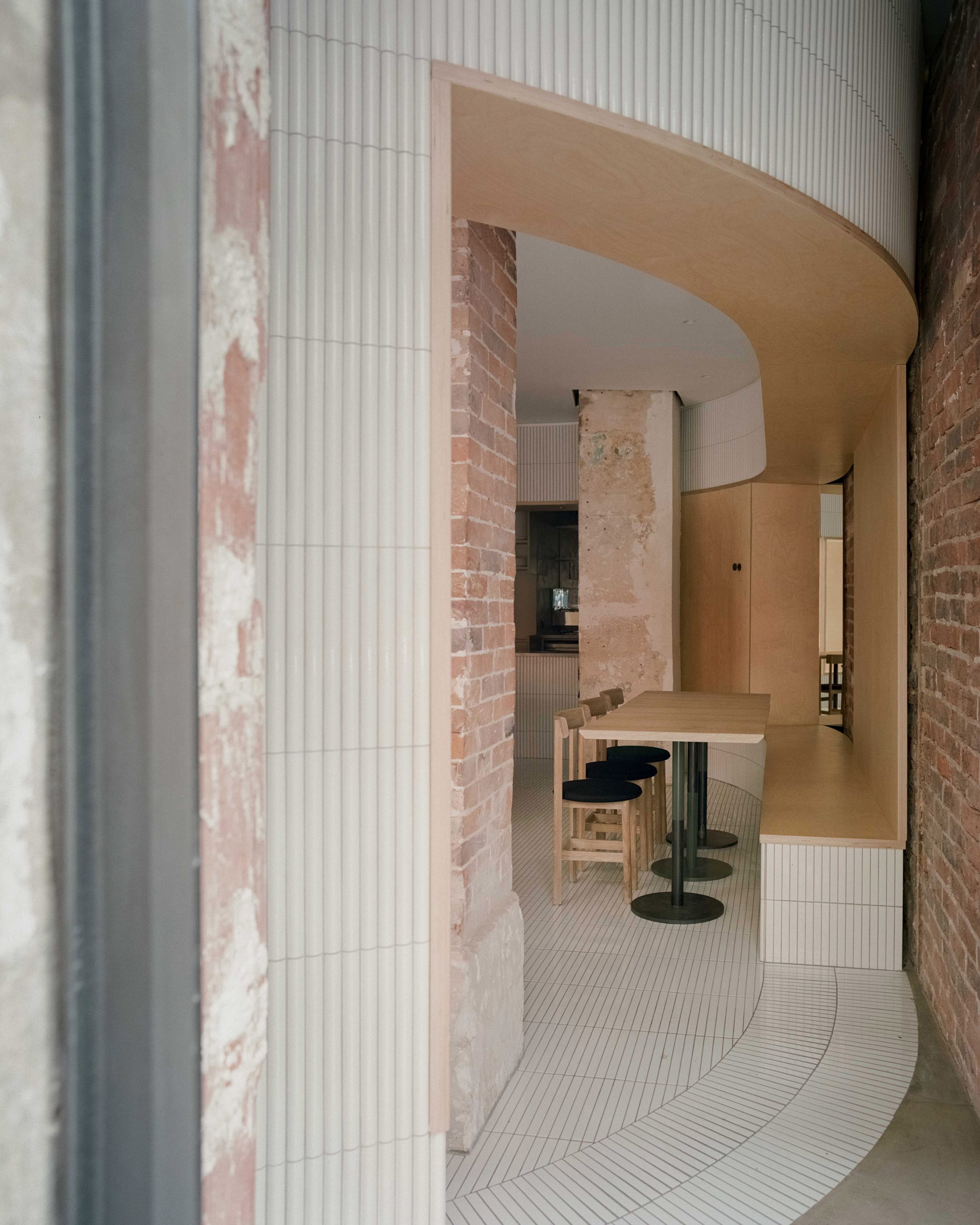
Other than a couple of tube lights – specifically chosen by Neri&Hu to stand in "stark modern contrast" to the crumbling stone walls – decor in Papi has been kept to a minimum.
A few mirrors have also been incorporated within the cylinder.
"[The mirrors] create dynamic perspectives and voyeuristic moments between interior and exterior, but also invite guests within to cross gazes," concluded the studio.
Neri&Hu has been established since 2004. Other projects that the studio has completed this year include a cultural centre in Beijing that's covered with aluminium louvres and a hotel in Taipei that takes design cues from the city's urban landscape.
Photography is by Simone Bossi.
The post Neri&Hu keeps time-worn details in Parisian restaurant Papi appeared first on Dezeen.
from Dezeen https://ift.tt/35NtDww
No comments:
Post a Comment