Domstate Zorghotel is a rehabilitation centre in Utrecht, the Netherlands, designed by Dutch studio Van Eijk & Van der Lubbe to give patients a hotel experience.
Van Eijk & Van der Lubbe deliberately approached the interiors of the 84-bed health facility like they were creating a 4-star hotel to give patients a more comfortable stay.
"Unlike similar 'healing environments', this care hotel is designed from the user's perspective," said the studio.
"The interior actively participates in the rehabilitation process of the patients," they added. "From small interior accessories to large spatial gestures, everything is focussed on the process of healing."
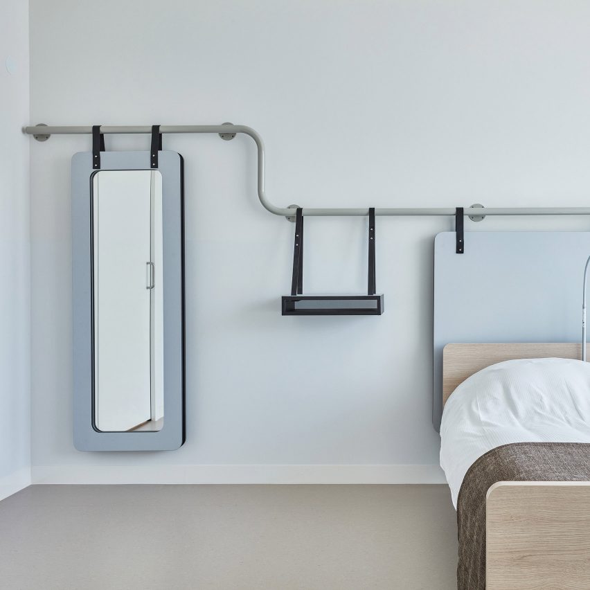
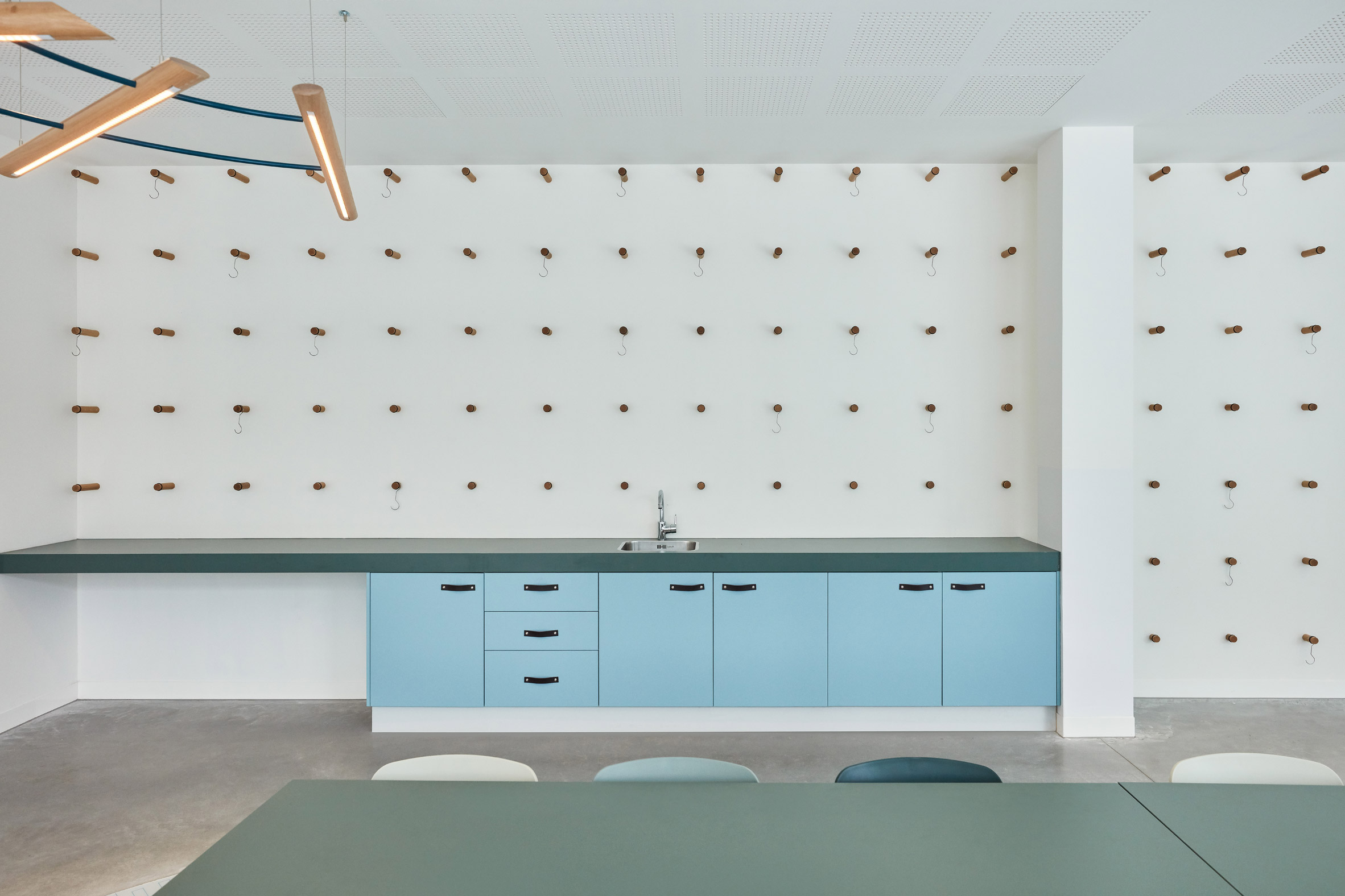
In the patients' rooms elements such as a mirror, a shelf and a headboard hang from a curved rail on the wall on thick leather straps. As well as providing a striking visual element, the rail can be used for rehabilitation exercises.
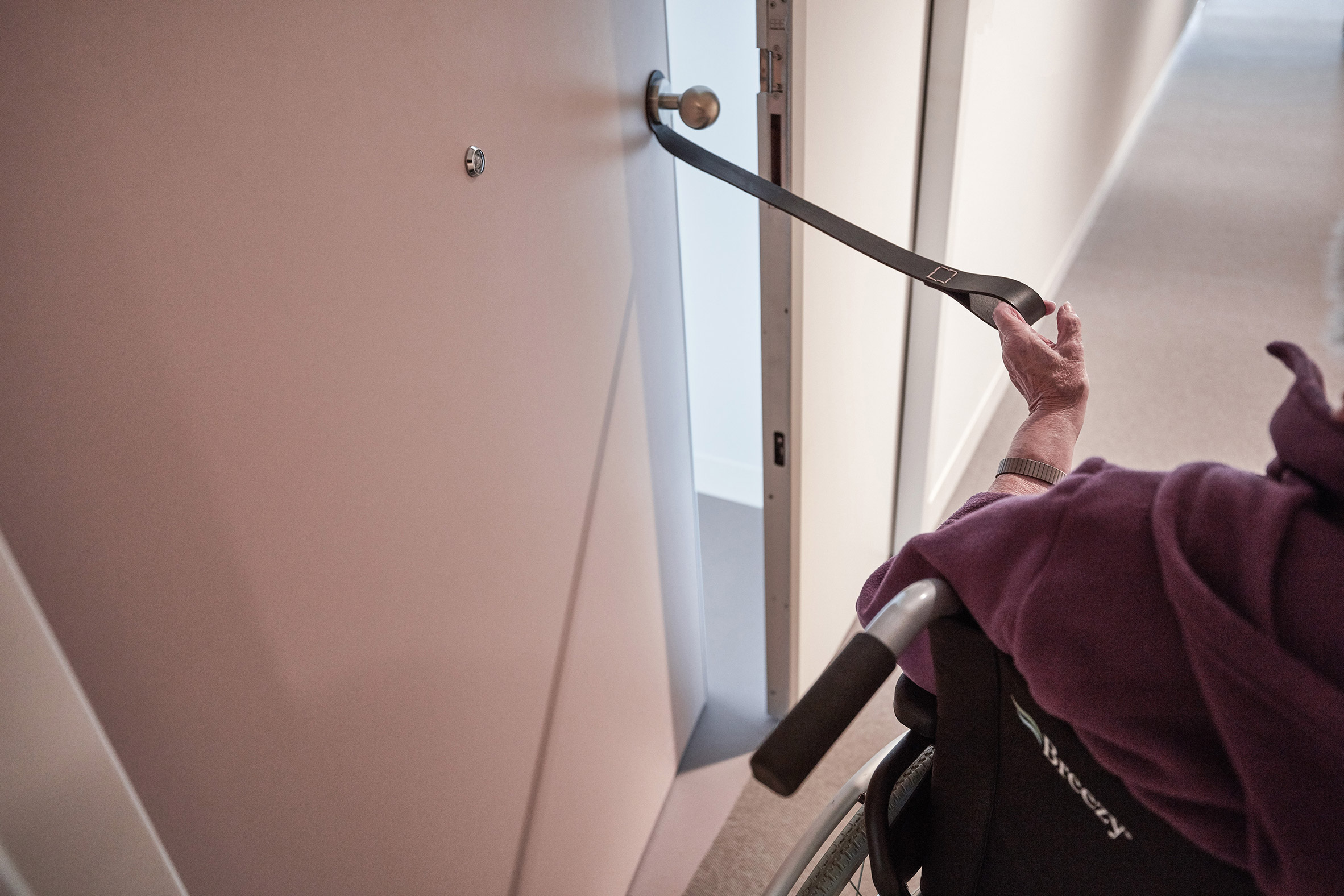
Straps on handles and peepholes placed at different levels cater to patients with different levels of mobility.
To add to the boutique hotel vibe, each floor of rooms has a different colour scheme.
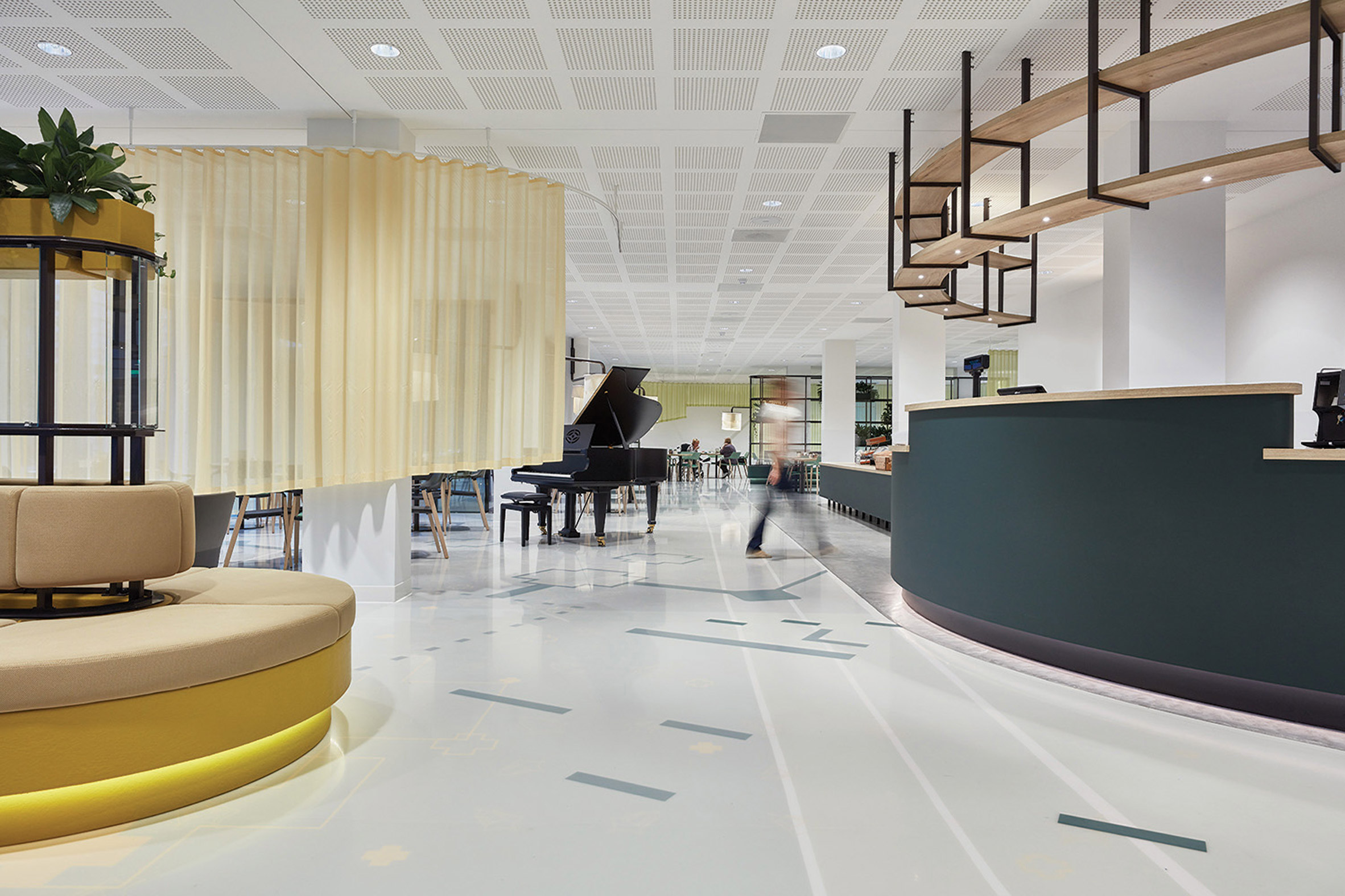
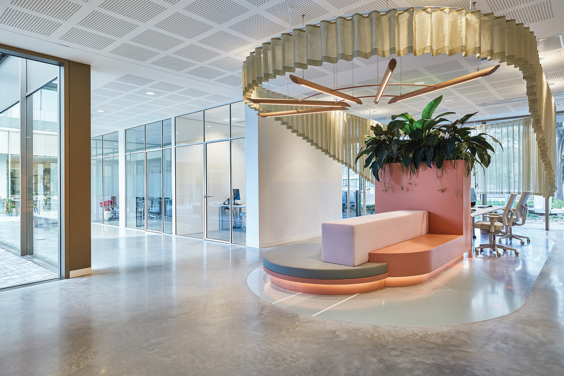
Colour is a central part of making the interiors feel less institutional. The lobby features a grey-blue curving reception desk and rounded seating with a mustard-yellow base.
Fabric curtains on rails can be used to screen areas off and a grand piano can be used for practices and performances.
Graphic markings on the floor mimic different floor finishes and change colour according to the area, such as blue in the lobby, green in the dining room and pink in staff areas.
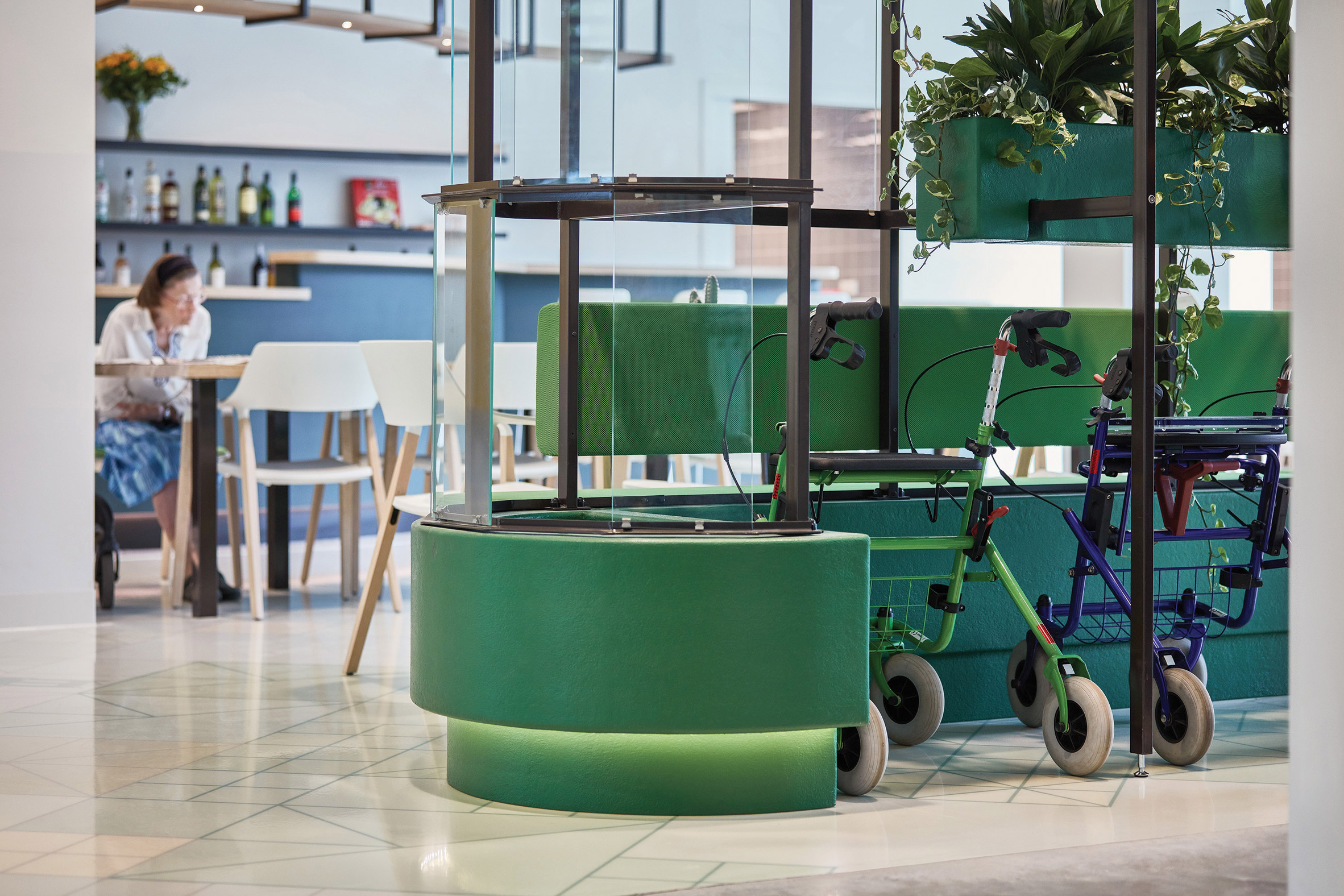
In Domstate Zorghotel's restaurant, a curving green unit provides a discreet place to park wheelchairs and walkers. Rooms such as this are designed to subtly encourage guests to practise for real-world situations when they leave.
Plants spill out of boxes in the built-in dividers and seating areas.
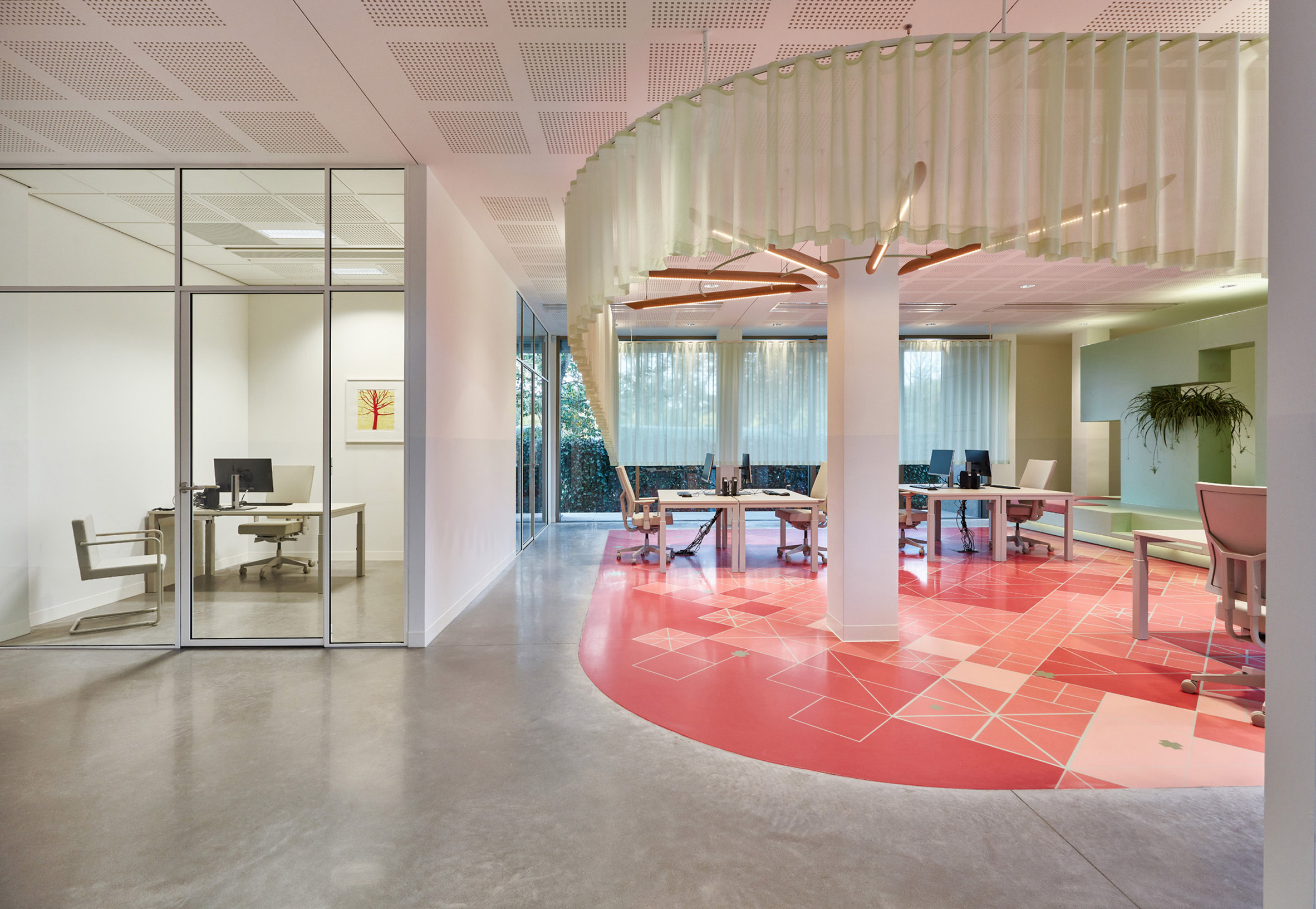
Van Eijk & Van der Lubbe were careful to make sure the staff areas are fun and comfortable too.
A pink curved multi-level banquette screened by plants in pink planters forms an attractive place for employees to sit outside of their desks. Geometric markings in the pink floor add interest to another staff area.
"In the areas of the building where employees work, it's OK for them to colour outside the lines," said Van Eijk & Van der Lubbe.
"The design for these areas is aimed at making the most of innovation and diversity in day-to-day work."
Van Eijk & Van der Lubbe was founded in 1998 by Dutch designers Miriam van der Lubbe and Niels van Eijk. Their previous work includes a mirrored concept car and the refurbishment of a concert hall in Eindhoven.
Domstate Zorghotel has been shortlisted for Dezeen Awards 2020 in the leisure and wellness interior category, alongside a children's hospital in Thailand and an underground spa in New York.
The post Van Eijk & Van der Lubbe designs Utrecht care facility like a boutique hotel appeared first on Dezeen.
from Dezeen https://ift.tt/2IhGQFy
No comments:
Post a Comment