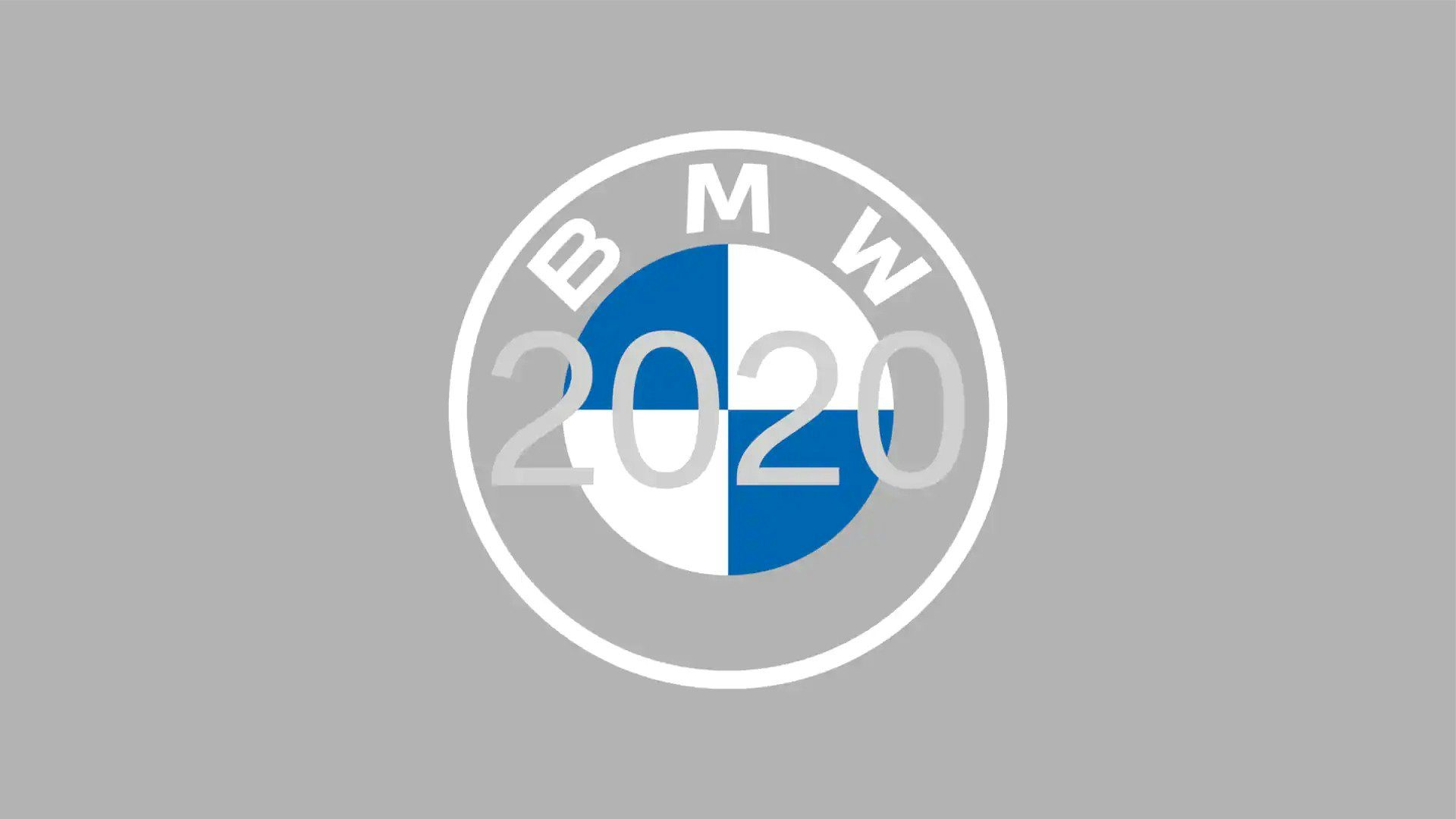
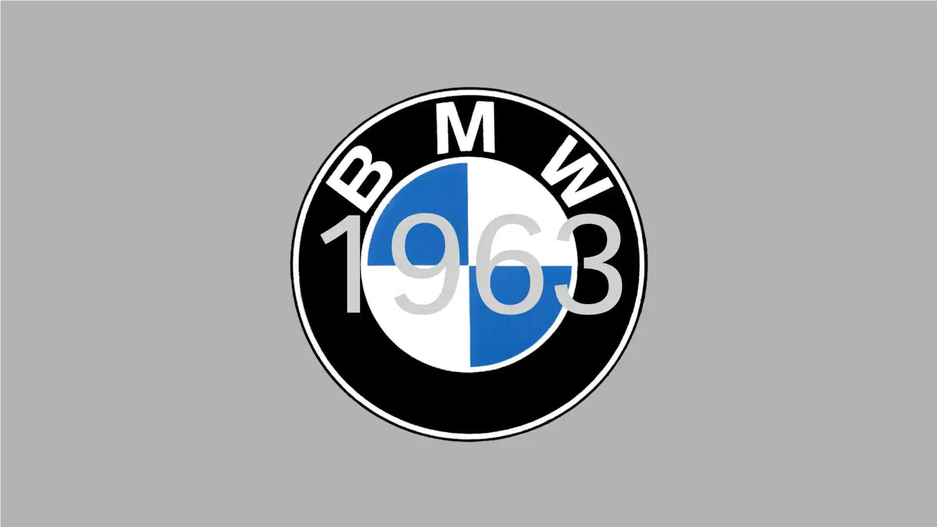
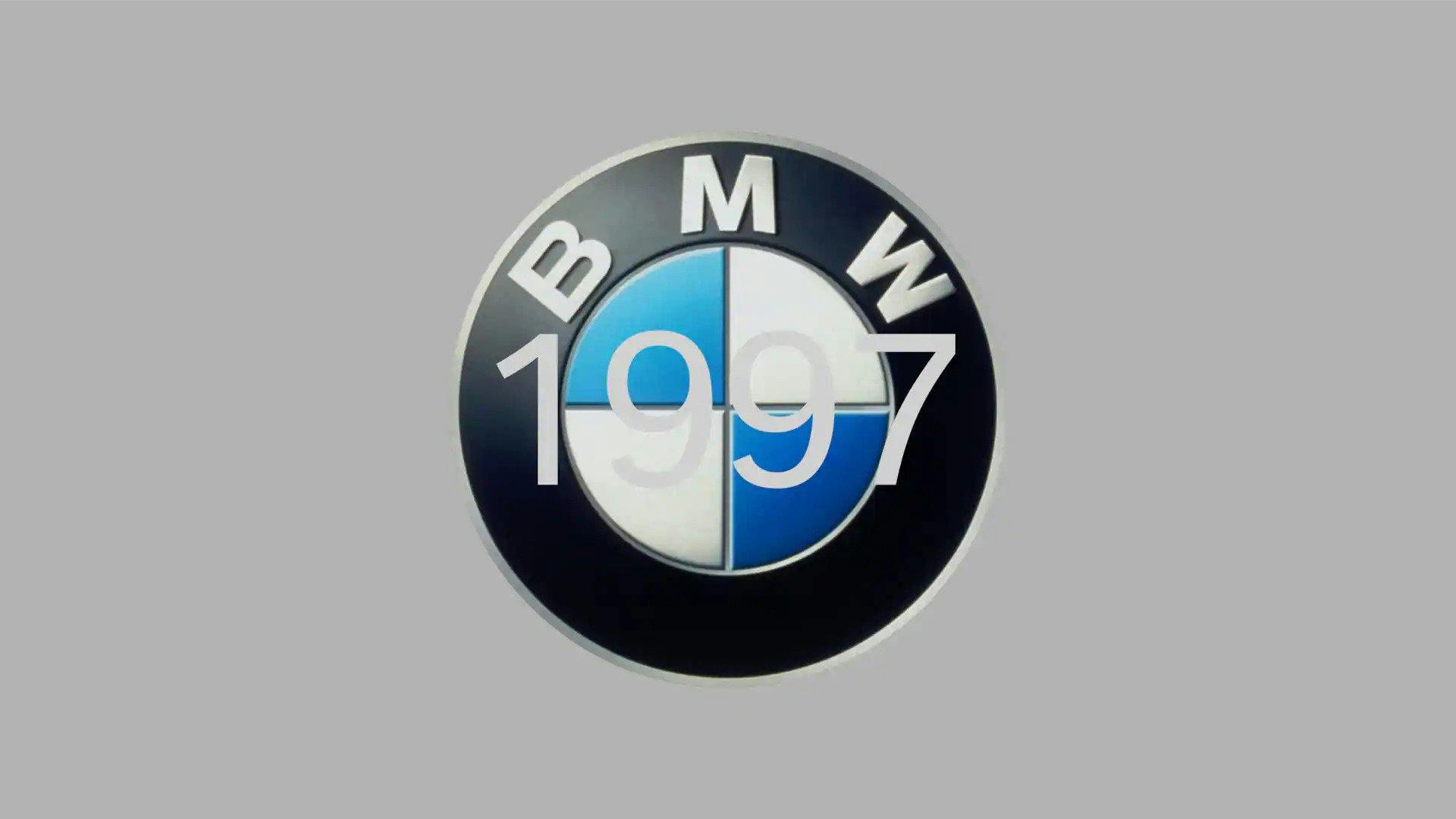
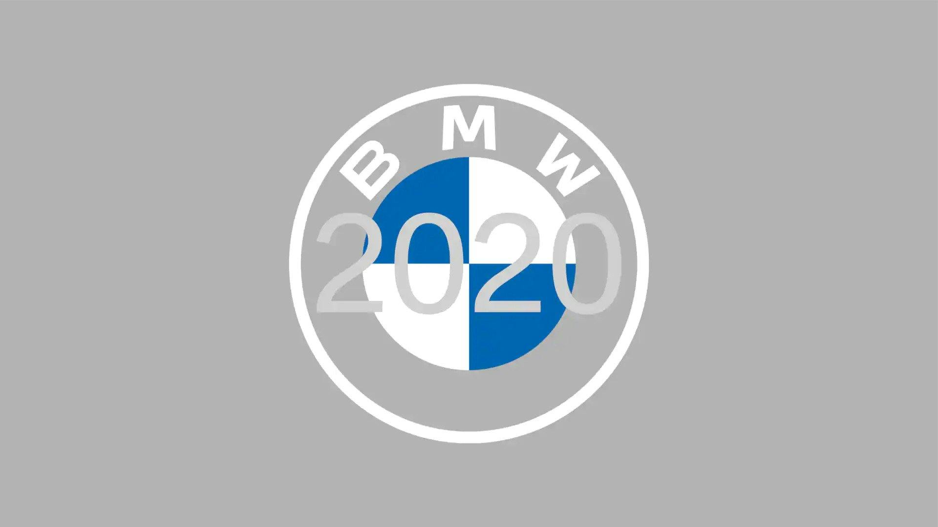
For the first time in 23 years – and only the sixth in its entire history – BMW has unveiled a new logo intended to give a fresher look to its historic emblem. The new flat design includes a transparent background, doing away with the contrasting black ring that has been core to its look throughout the brand’s lifespan.
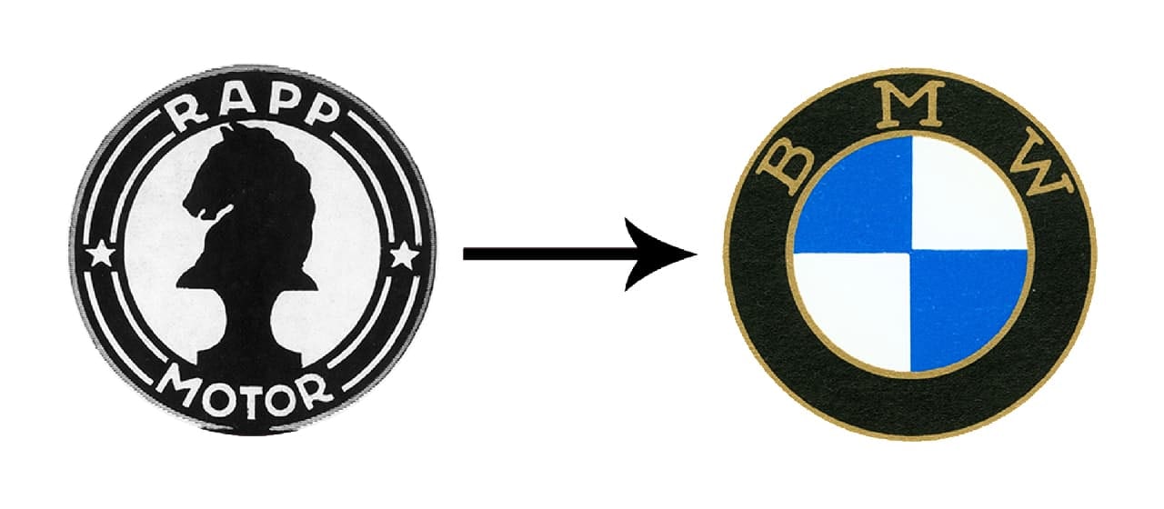
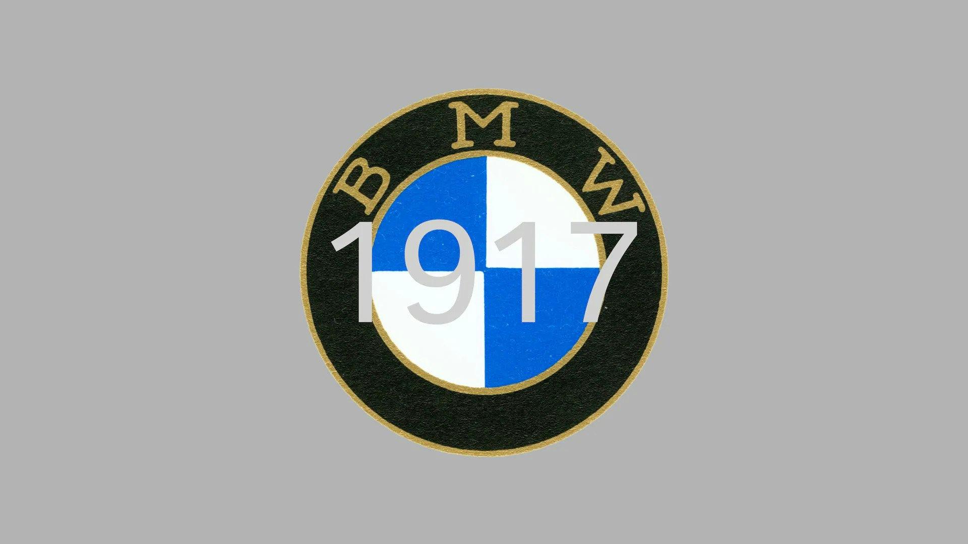
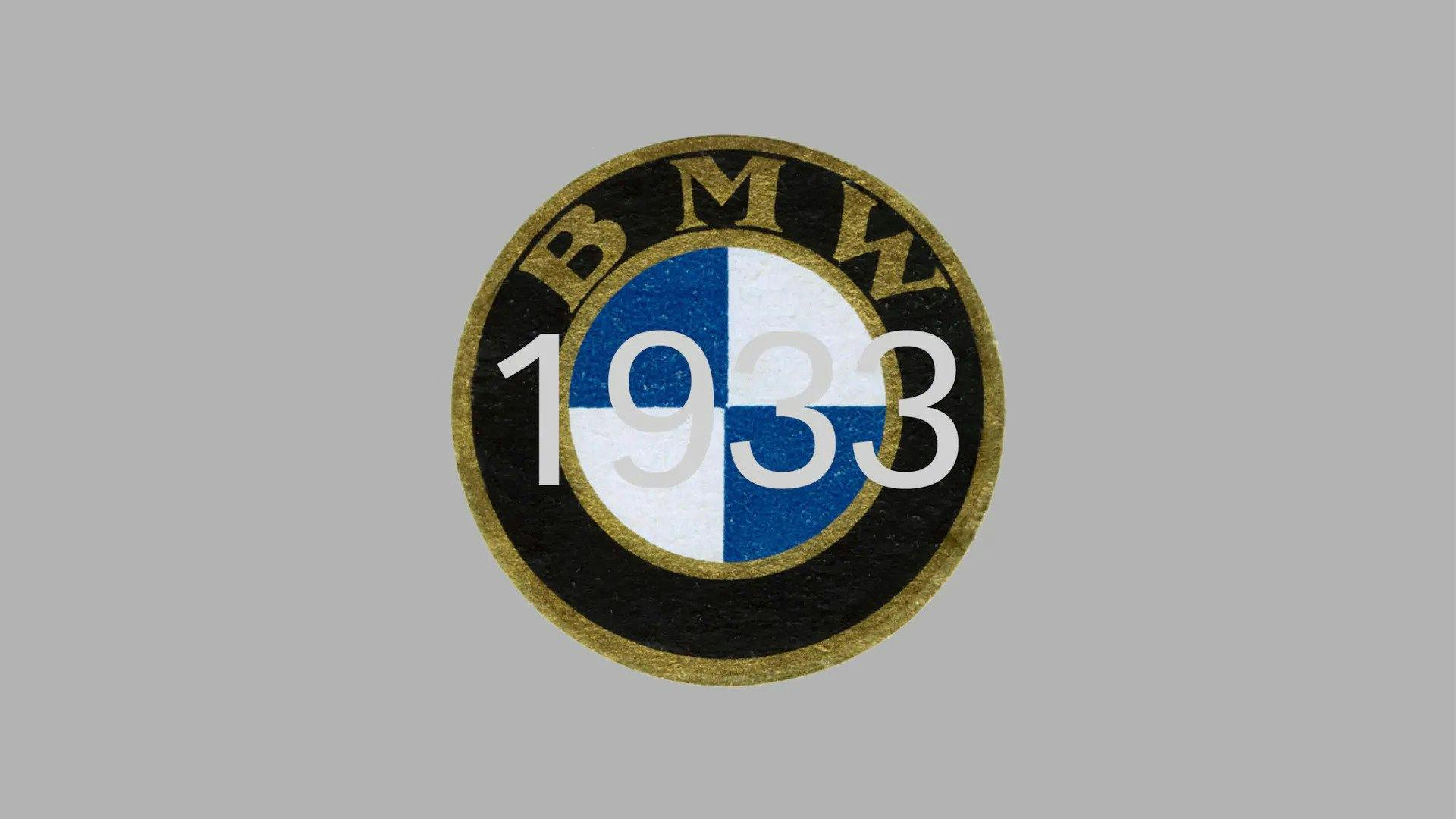
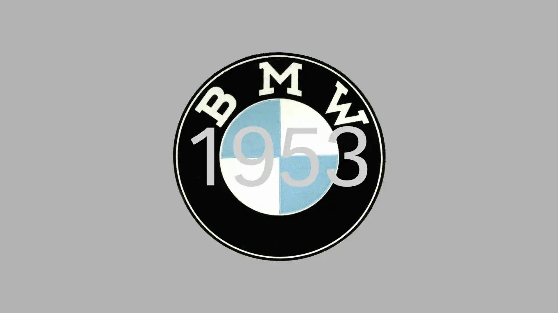
To launch the redesign, the car manufacturer released an article on its website delving into the history of the logo. BMW, which stands for the Bayerische Motoren Werke (Bavarian Motor Works), evolved from an aircraft engine manufacturer, Rapp Motorenwerke. When BMW launched in 1917, it carried over the black circular border seen in the Rapp design, while adding its own nod to BMW’s Bavarian roots with the blue and white quadrants – the colours of State of Bavaria (though ordered inversely due to trademark limitations at the time).
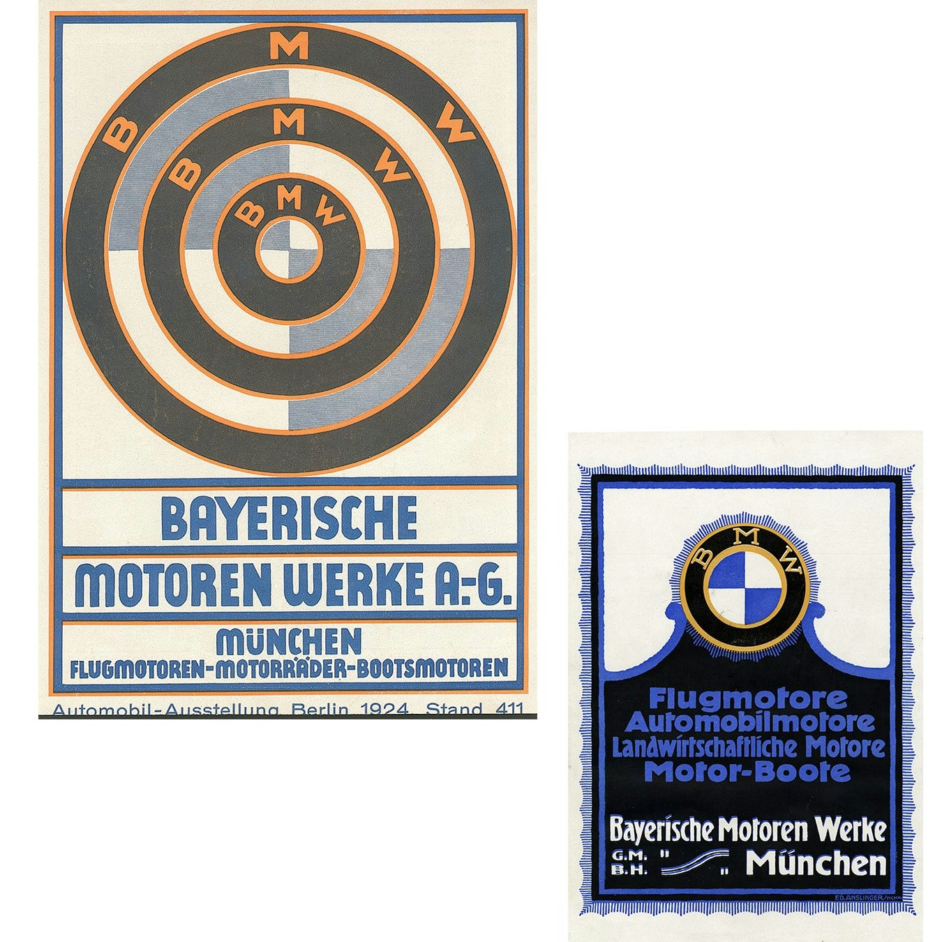
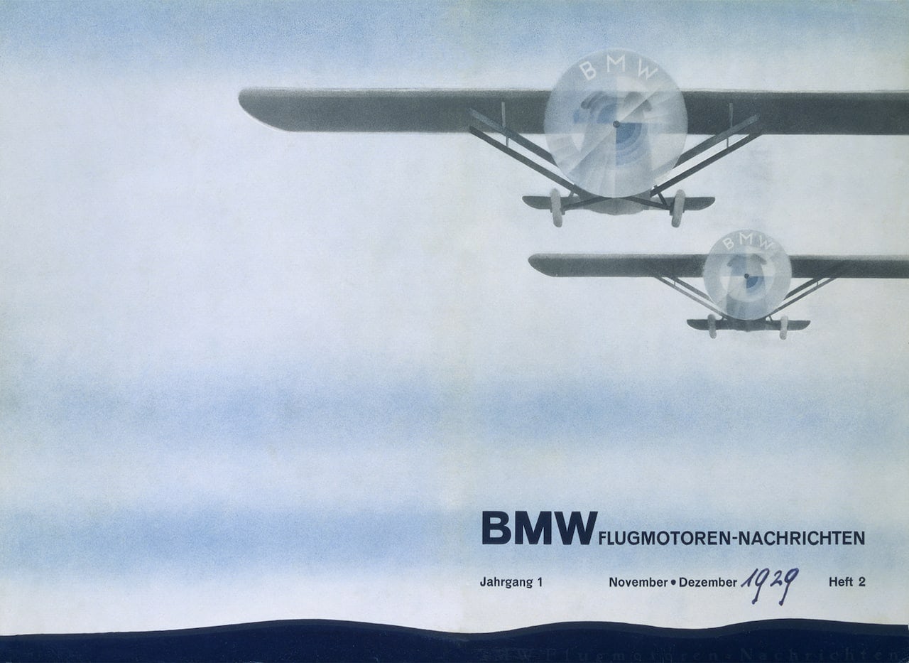
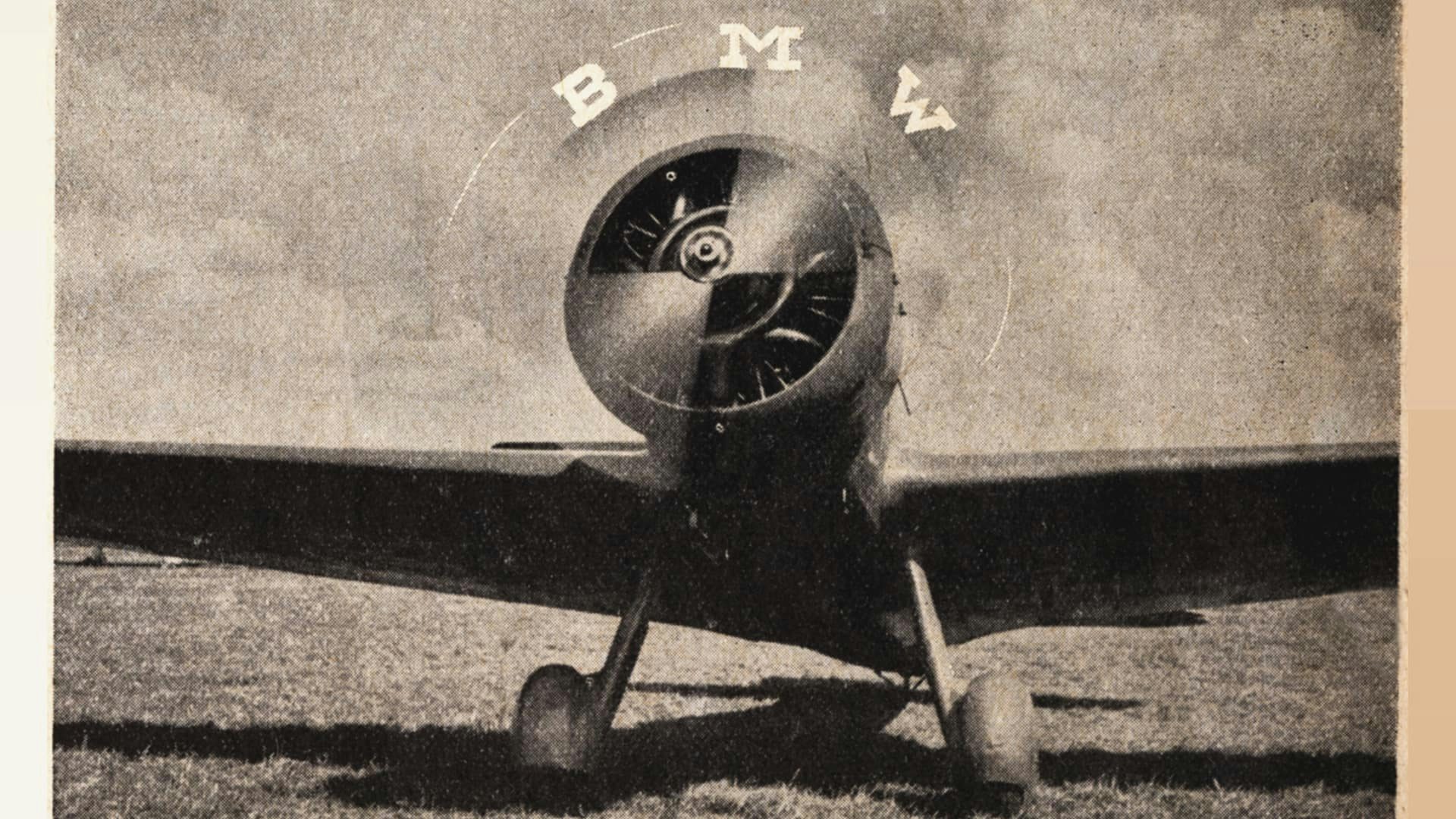
The article puts to bed a long-held misconception about the logo’s origins. The emblem was widely believed to reflect a propeller, due to a string of ads it ran – first in 1929 and again in 1942 – that invited this comparison. The original logo had been designed long before these ads ran, but as pointed out by Fred Jakobs, archive director at BMW Group Classic, the brand did little to correct these assumptions.
“For a long time, BMW made little effort to correct the myth that the BMW badge is a propeller,” he said in the article. “This interpretation has been commonplace for 90 years, so in the meantime it has acquired a certain justification”.
The new design for 2020 sees the removal of significant elements tying it to both Rapp and its own history, in particular in the decision to no longer use black. It has drawn criticism for appearing unfinished, yet BMW frames the transparency of the logo as part of a wider new chapter in the company’s history, as it becomes a “relationship brand”.
“The new communication logo radiates openness and clarity,” said Jens Thiemer, senior vice president of customer & brand. “With visual restraint and graphic we are equipping ourselves flexibly for the wide variety of contact points in communication at which BMW will show its presence online and offline in the future.”
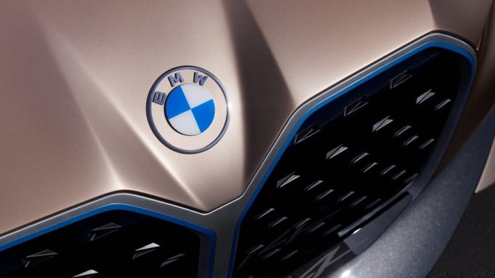
BMW has announced that the new logo will only be used across communications, and is not a badge for the vehicles themselves (though, a little confusingly, it does appear on the BMW i4 concept electric car, shown above). “The new logo is a new media branding and will be used in addition to the existing logo. It won’t be used on the vehicles or in the exterior and interior labelling of our dealerships, the existing logo remains in use there,” the brand said in a statement.
This decision seems symbolic of the difficulties brands face in creating identities that work well both online and on physical products – at present, BMW has essentially split its identity in these different worlds, a far from ideal solution at a time when continuity across all touchpoints is king. It seems likely that having one foot in the past and the other in the present will prove difficult for the brand: the question is whether we will soon see this new logo used everywhere, or will it be ditched altogether?
The post BMW delves into its brand history as it unveils new logo appeared first on Creative Review.
from Creative Review https://ift.tt/330q18C

No comments:
Post a Comment