Pentagram has redesigned the visual identity of book publisher Thames & Hudson, including a new wordmark and symbol.
Harry Pearce, partner at London’s Pentagram office, says that the new identity is “part modernisation and part restoration” of the brand.

The illustrated book publisher, which has headquarters in London, was founded in 1942 by Walter and Eva Neurath with the goal to make the art world more accessible. Its range of products include art and fashion titles, as well as children’s books.
Creating a widely-applicable cartouche

There were two focuses for the rebrand; to recognise the publisher’s “unique position” by modernising it but also recognising its history, and also that it “needed to work across a wide range of applications in print and digital”
After research into Thames & Hudson’s previous logos, the team has created a new cartouche, which is a frame around a design or inscription. An oval now surrounds the publisher’s monogram (written in a bespoke typography) and its dolphin symbol.

The dolphins represent the two rivers of the publisher’s name; Thames from London, and the Hudson from New York, where there is a sister office. The animals also represent friendship and intelligence, according to the publisher as well as suggesting a “connection between the Old World and the New” because of their east and west-facing positions.
Pearce tells Design Week that the “new form is a more modern construct, but inspired by the older idea”. Thames & Hudson, he says, “required a mark that represented the whole story”.

As such, the cartouche — “the most complete visual shorthand of the brand” according to Pentagram — can be used alone or in place of the logotype and symbol. It appears across the brand, on marketing materials, the website, on the books themselves as well as on promotional material such as banners and carrier bags.

Pearce hopes that the cartouche is “neutral enough to cope with any other design style surrounding it”.
“The cartouche adapts to its surroundings, inhabiting colours that complement or contrast with it,” he adds.
“Bookish qualities”

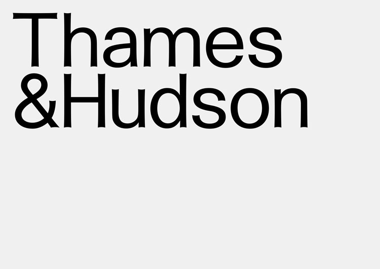
The redesigned wordmark is “modernist”, Pearce says, and “has a suggestion of the artisanal nature of bookmaking through the subtle detailing of its letterforms”.
Pearce tells Design Week: “Essentially the wordmark was inspired by a whole number of typographic references. Its form is somewhere between a sans and a true serif. If look at at scale you can see it’s made of subtle curves.”
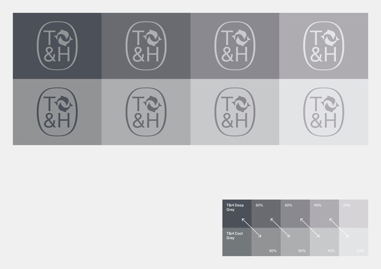
A colour palette of “cool and warm greys” has been inspired by the London office’s original mosaic, which also features two dolphins. It also as a neutral counterpart to some of the “colourful book covers”.

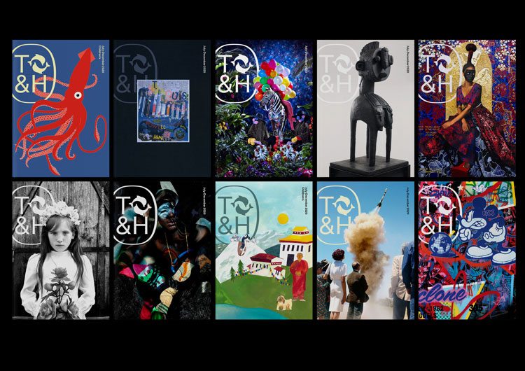
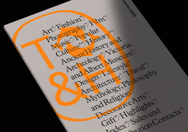
Thames & Hudson publish a biannual catalogue, whose format has been redesigned by Pentagram. Typeface Plaintain has been used for the body copy because of its “bookish qualities”, while Neue Haas Unica has been chosen for “supplementary information”. The catalogues’ covers feature an “off-centre” version of the cartouche “combined with imagery or bold typography”.

As the symbol is printed on books that come in a wide variety of sizes, three sizes of the dolphin symbol have been created to ensure “consistency and clarity”. The symbol is always centre aligned and placed on a 9mm baseline, which means that the books have a “consistent look when placed together on a shelf”.
For “very narrow spines” — defined as those below 7mm — the single-line logotype is used instead of the dolphins.
The World of Art

Thames & Hudson’s celebrated, and longest-running series, the World of Art is also being relaunched this month with the tagline: ‘See the arts through expert eyes.’
This series has been redesigned by Dutch design studio Kummer & Herrman, with a cover design inspired by the golden ratio, historically believed to be the mathematical proportion behind the harmony of nature, art and design.
The post Pentagram rebrands Thames & Hudson for “modernisation” and “restoration” appeared first on Design Week.
from Design Week https://ift.tt/2xi5G2E

No comments:
Post a Comment