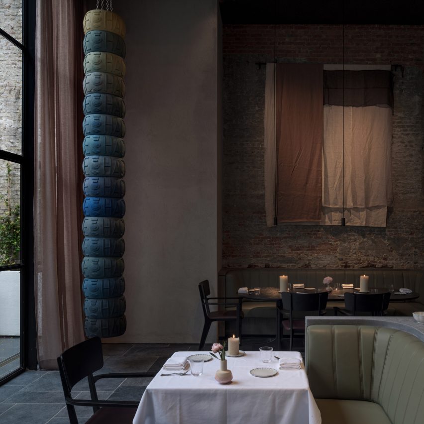
Danish design studio Space Copenhagen has used subdued shades of green and grey to deck out the dining room of Le Pristine restaurant in Antwerp, Belgium.
Le Pristine, which is headed up by three-Michelin-star chef Sergio Herman, occupies a 1960s modernist building.
Years of unfinished renovation works meant that the building's interior had several patchy brick walls and worn concrete columns.
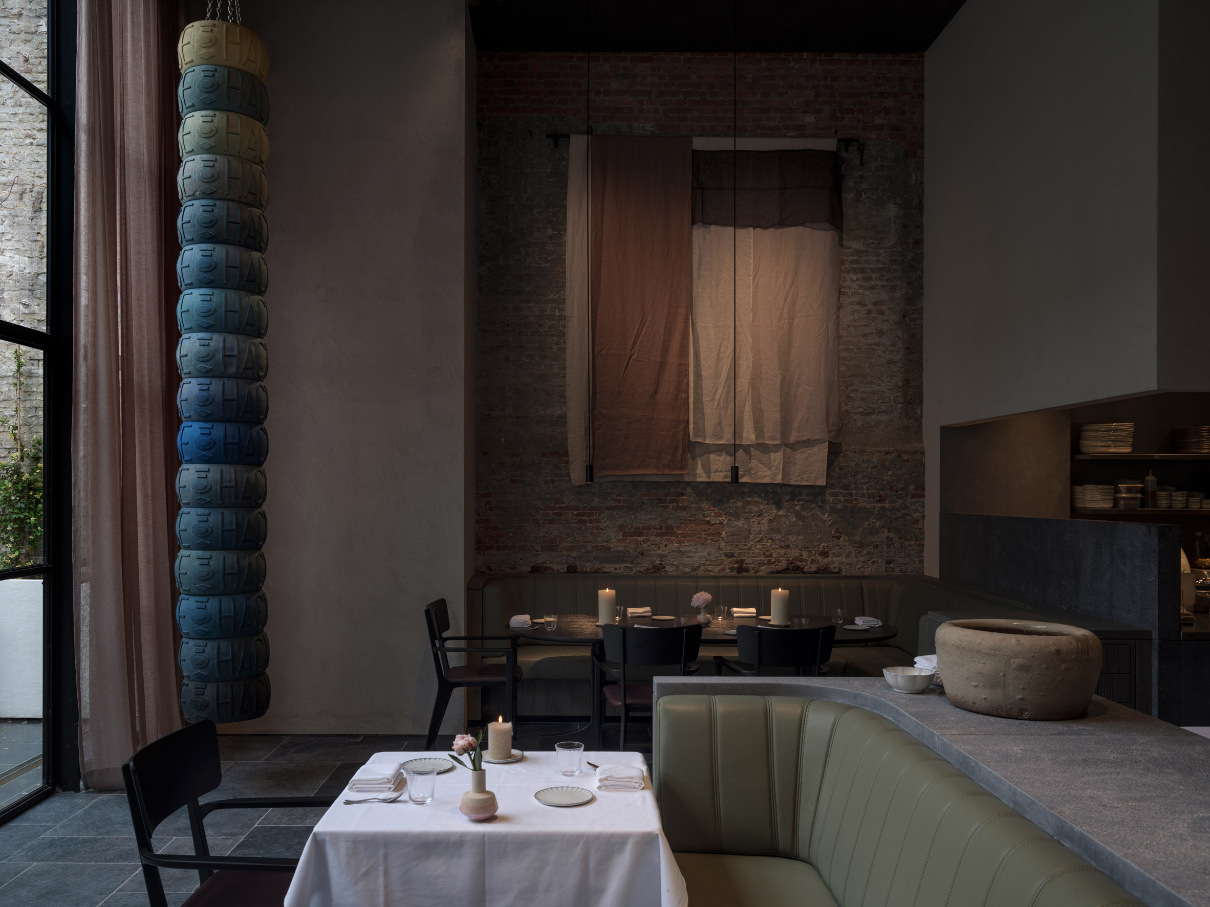
When Space Copenhagen was asked to transform the site into Le Pristine, it decided to keep these aged features, and designed the restaurant to appear as "an inviting collage of historic references".
"Antwerp is a relatively small city, but extremely design-driven," said Peter Bundgaard Rützou, who founded the studio alongside Signe Bindslev Henriksen.
"From the outset, we were fascinated by the renaissance architecture, history and the artists from the region, and the way they depicted rural and rudimentary settings, people eating, enjoying a meal with a sense of humbleness," he continued.
"This informed how we envisioned the social experience at Le Pristine and the restaurant has been designed with a sense of slow aesthetics as a vehicle for modern social encounter in Antwerp."
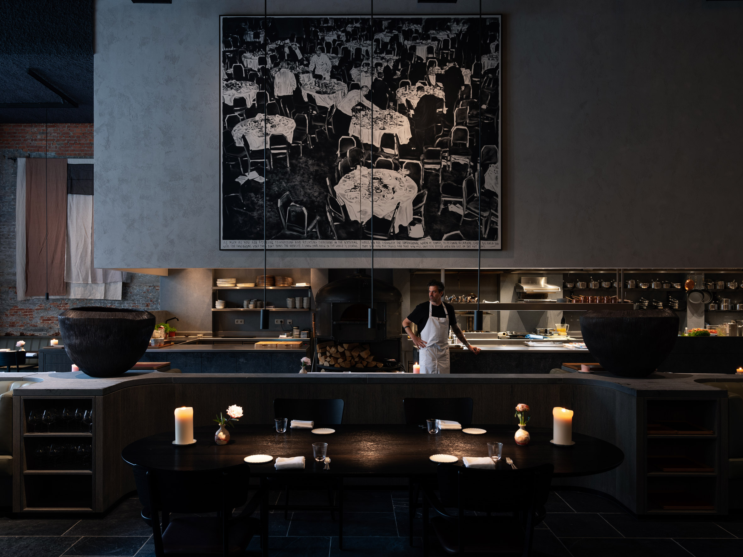
The dark shades used by Dutch and Flemish old master painters such as Rembrandt van Rijn, Johannes Vermeer and Peter Paul Rubens informed the colour palette of Le Prestine's ground-floor dining area.
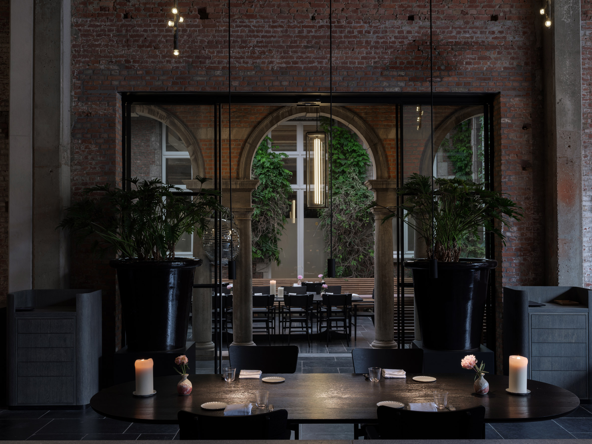
Murky green leather seating banquettes have been paired with bespoke black dining chairs, while smoked-oak cabinetry that accommodates extra glassware and crockery has been stained milky grey.
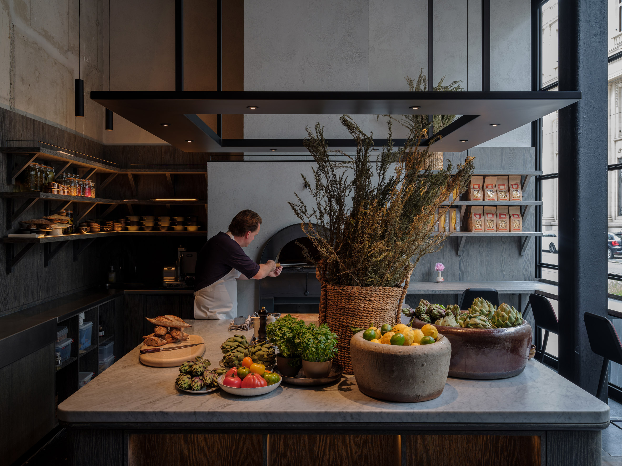
New elements like the volume above the kitchen and the wood-fire oven in Le Pristine's in-house cafe have also been painted dark grey.
Colour is provided by a five-metre-high sculpture by Dutch artist Frederik Molenschot that dangles from the dining room ceiling. Titled Hacked Cheese, the piece comprises oversized blue-tinted wheels of parmesan that are suspended like a punching bag.
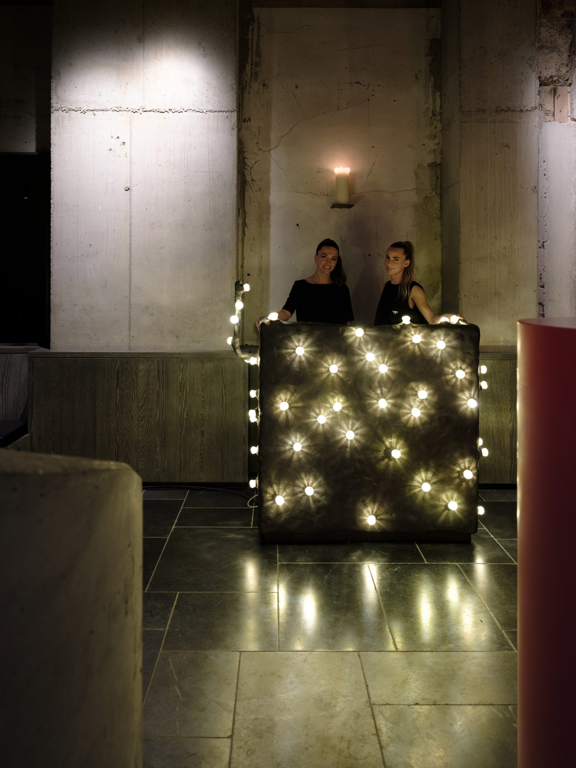
Dutch designers Maarten Baas and Bertjan Pot have also collaborated to create a service desk for the restaurant's entrance, which is sporadically dotted with exposed light bulbs.
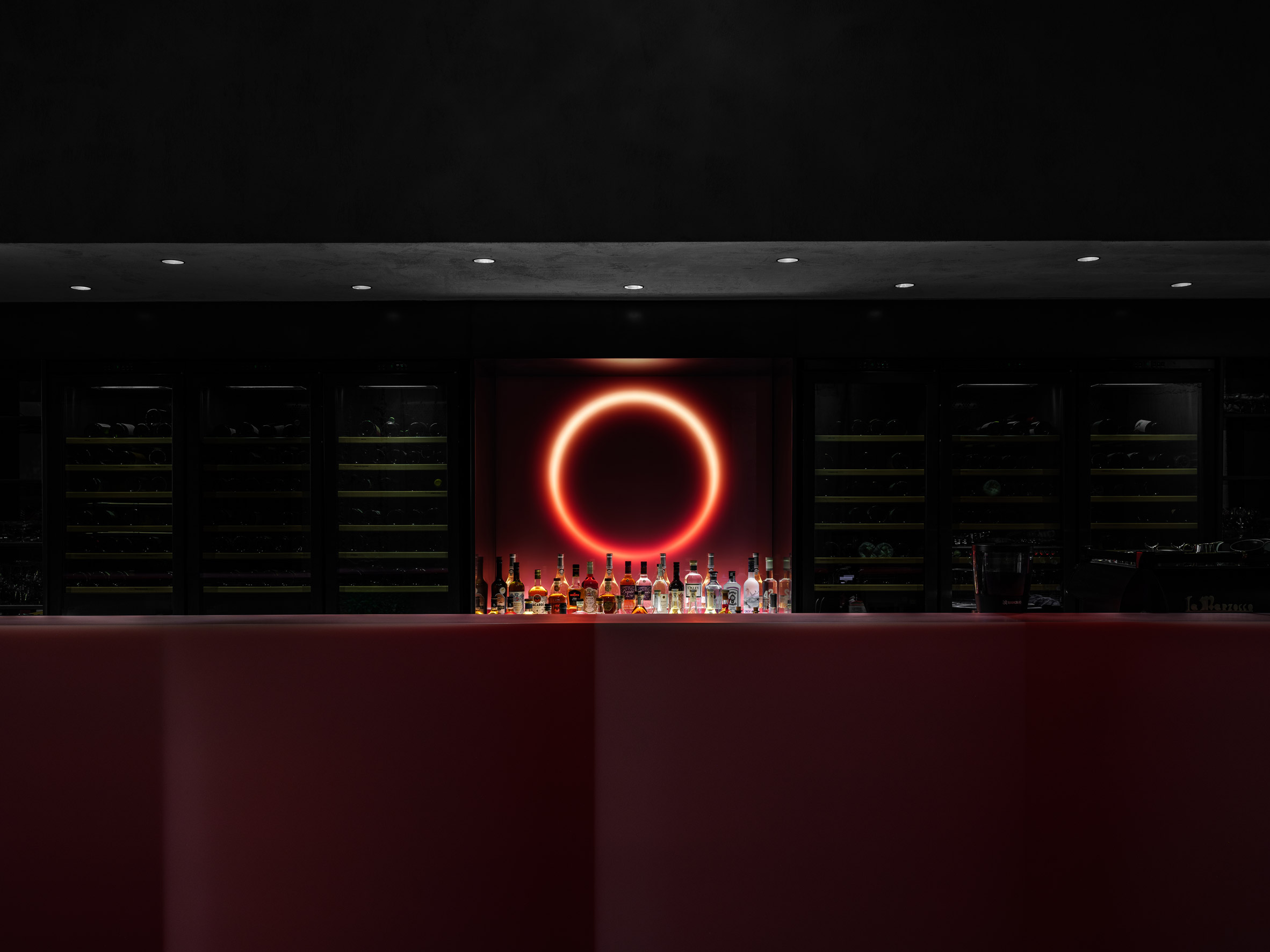
More colour appears up on the first floor, where Rotterdam-based designer Sabine Marcelis has created a seven-metre-long drinks counter from puce-pink resin.
Marcelis has embedded a block of the same coloured resin with a single white-neon tube to form a small-scale light installation behind the bar, which emits a pinkish glow.
Le Pristine also has two courtyards – one of them is planted with a 10-metre-tall tree and features a huge pile of firewood that's used in the wood oven.
The other courtyard overlooks a neighbouring 17th-century mansion that hosts a store of Belgian fashion brand Verso, which chef Herman partnered with to open the restaurant.
Space Copenhagen has been established since 2005 and designed the interiors of a number of other restaurants, particularly those in the Danish capital.
Others include LouLou, which veers away from the typically restrained Nordic aesthetic and features plush velvet furnishings, and Musling, which has oakwood floors and simple plaster-washed walls.
Last month, the studio also took part in a live panel discussion as part of Dezeen's Virtual Design Festival, where it talked about merging Eastern and Western traditions in design.
Photography is by Peter Paul de Meijer.
The post Moody interiors of Le Pristine restaurant by Space Copenhagen takes cues from the Old Masters appeared first on Dezeen.
from Dezeen https://ift.tt/38XS9fl
No comments:
Post a Comment